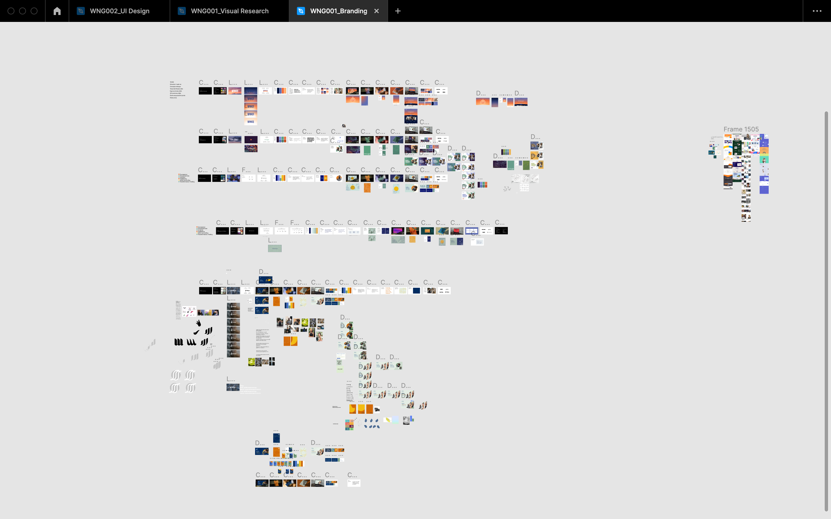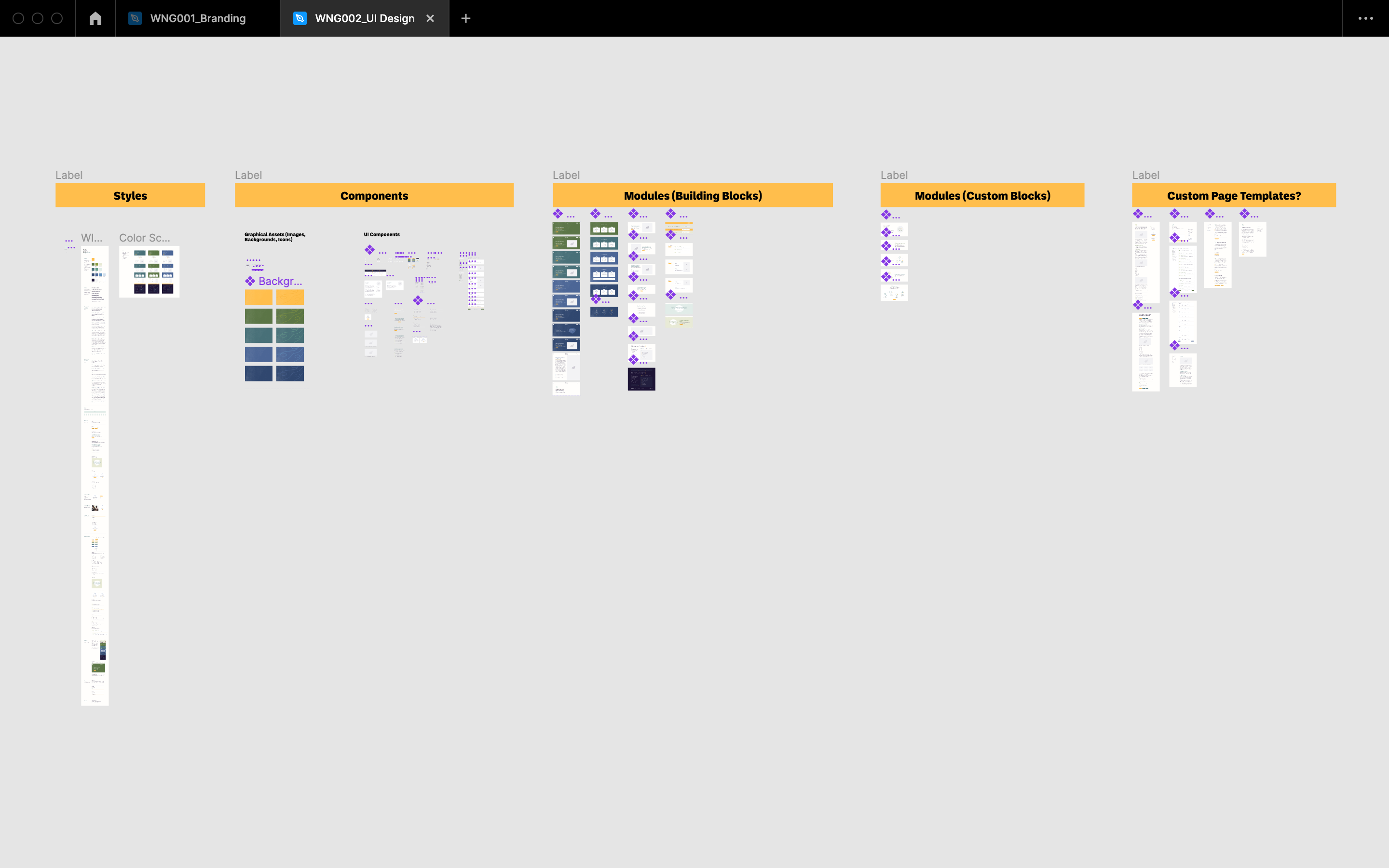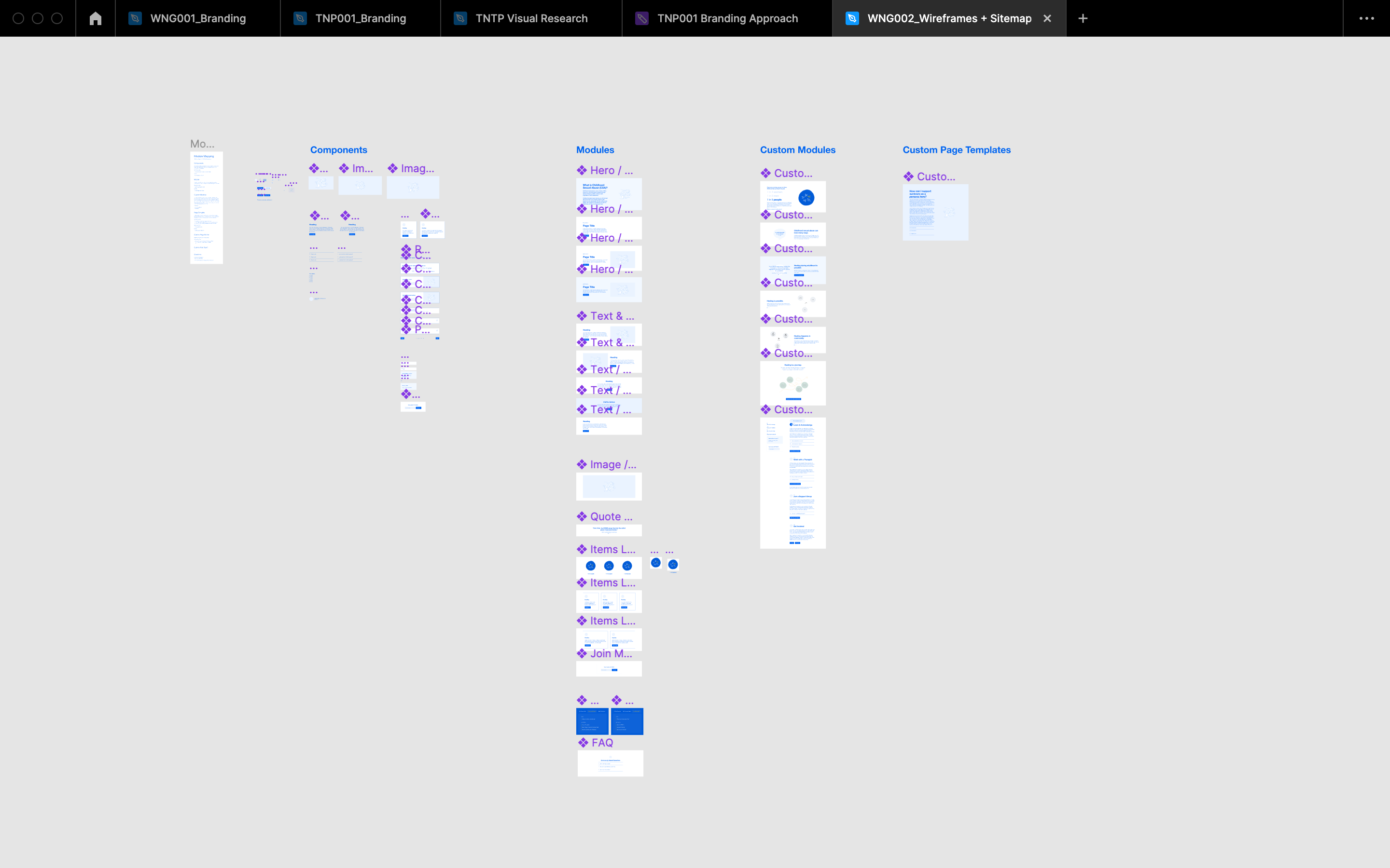
Exploring visual expressions around healing journeys
with WINGS
In my role as UX/UI designer at Radish Lab, I partnered with WINGS to design a brand identity and website experience that guides survivors in their discovery of support services and educational resources. We explored the question: How might the idea of healing be expressed in the WINGS brand?
About the Client
WINGS’ mission is to ensure that everyone has access to the resources they need to speak about, heal from, and thrive beyond childhood sexual abuse trauma. WINGS engages adult survivors, loved ones, providers, and community leaders to acknowledge the reality of this trauma and respond with care and compassion.
Collaborators

Healing needs time and space.
Healing can be a rocky, ambiguous process; therefore, the brand needed to practice patience and create space. As a pillar of support, WINGS is there to provide gentle nudges while also being clear and actionable.
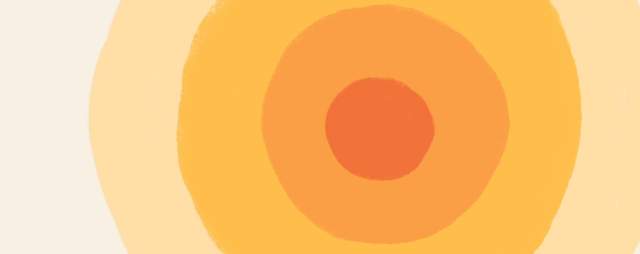
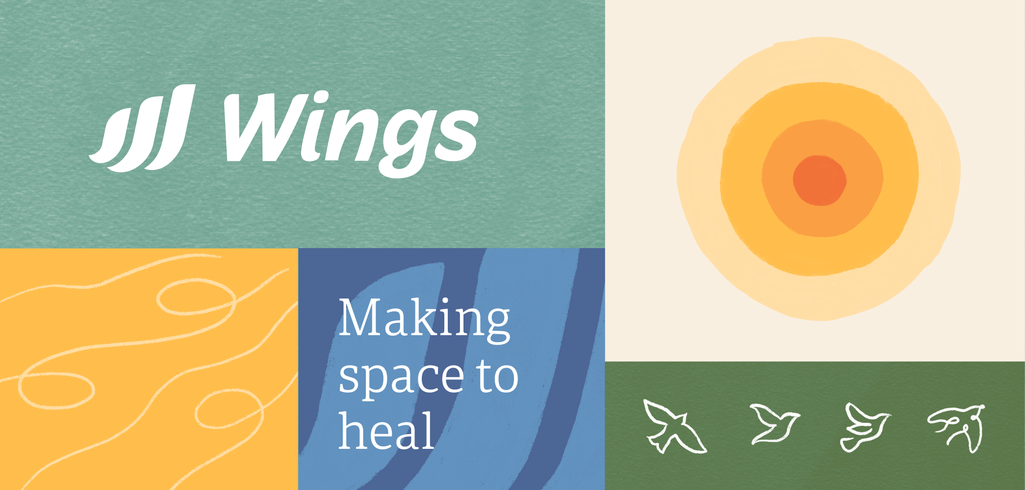
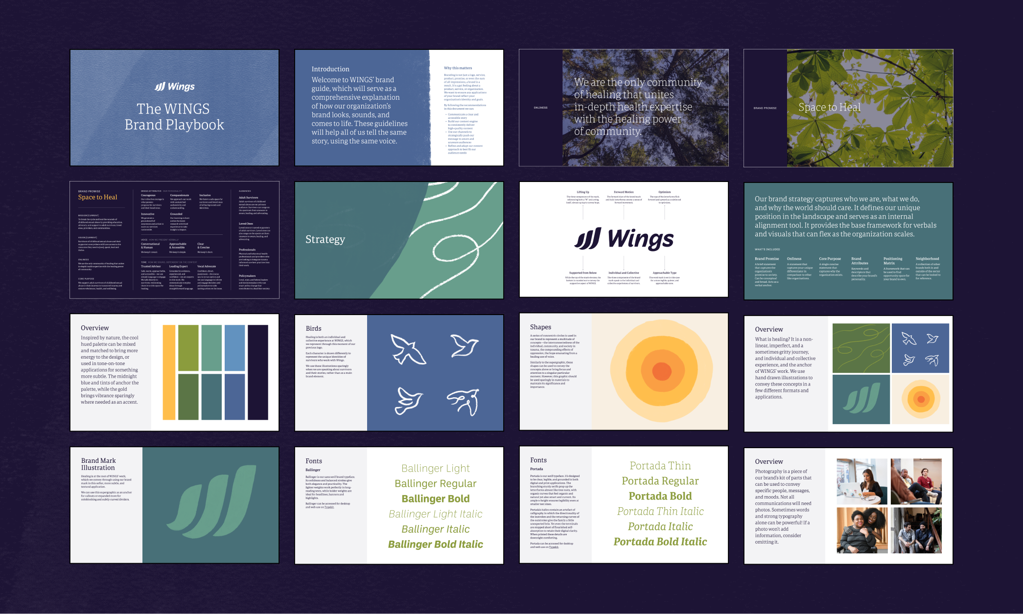
Inspired by the visual language around breathing and meditation practices, we incorporated circles that radiate outwards into the brand’s graphical system. The concentric circles speaks to the interconnectedness of the individual, community, and society– not only in how trauma is perpetuated, but in how people heal as well.

Nature also inspired our color palette of watery blues, mossy teals, and earthy greens. This array of calming hues is punctuated with an optimistic, sunny yellow and anchored by a deep, more serious indigo. The final palette invites subtle, layered applications and also provides flexibility for bolder, high-contrast moments. The result is a color expression that feels both comforting and crisp.
Healing is imperfect and non-linear.
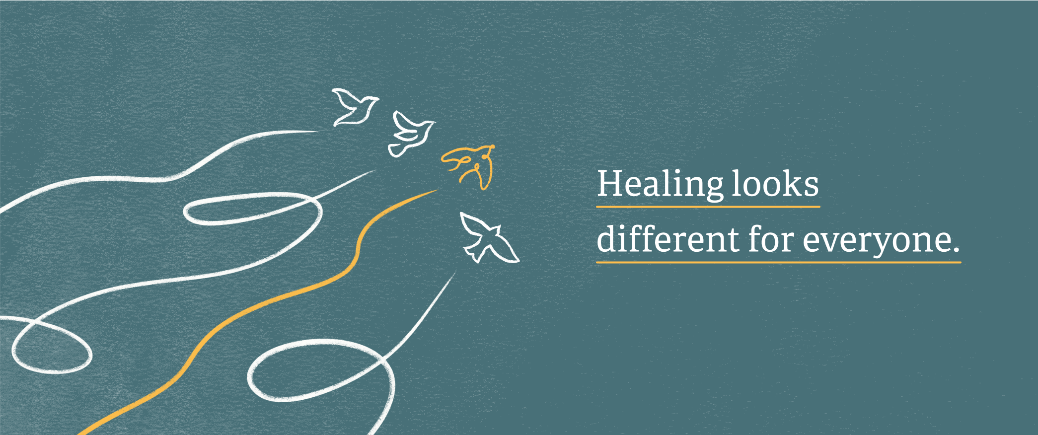
Healing looks different for everyone. Therefore, we wanted the brand to celebrate imperfection and embrace individuality. The WINGS brand needed to feel human and approachable– reflecting the interpersonal nature of their work with survivors.
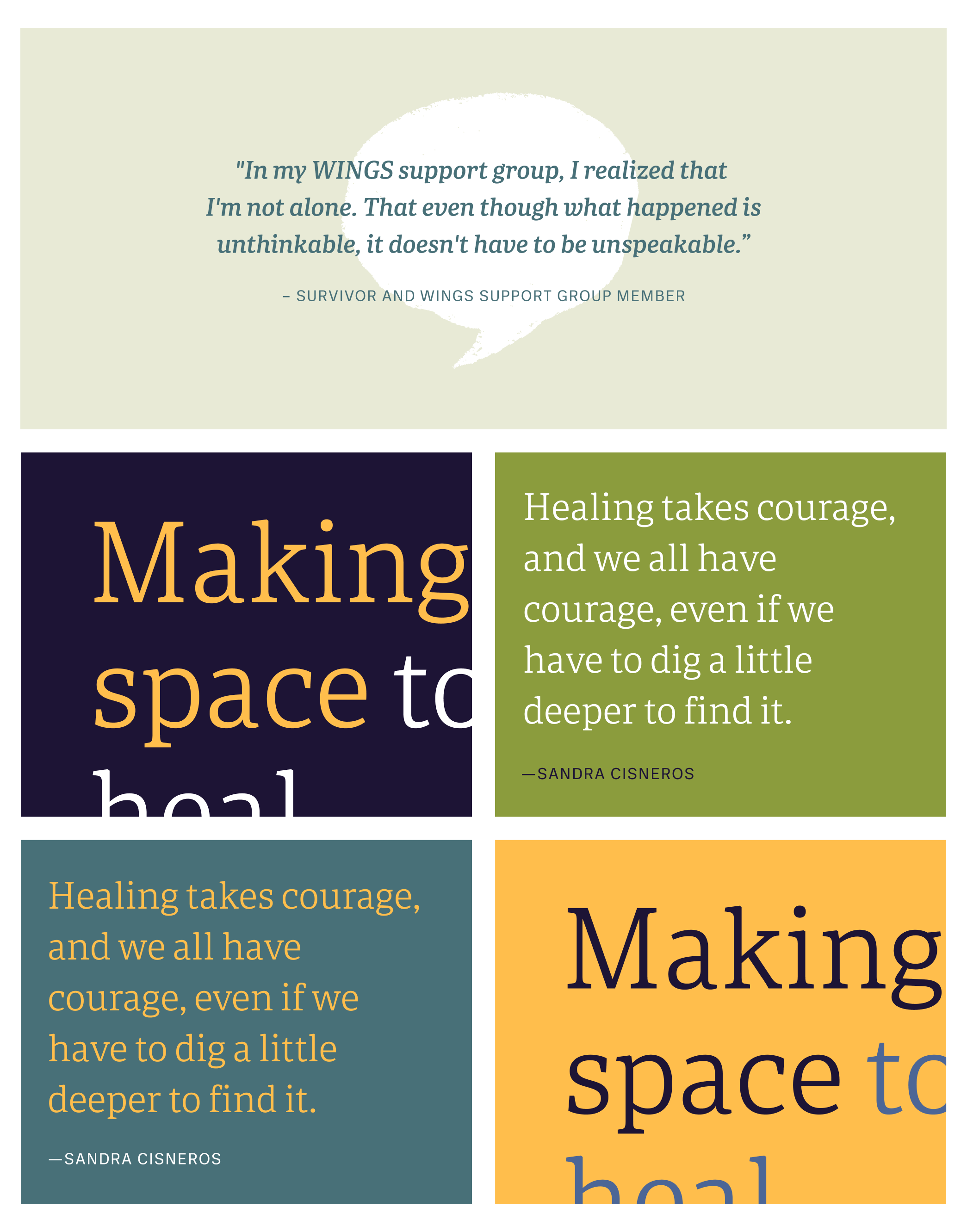
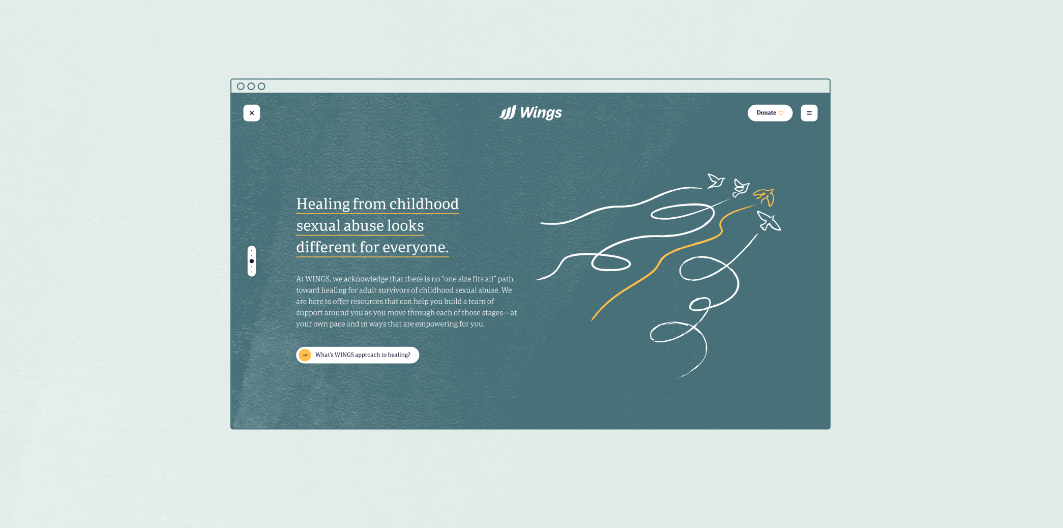
The design system features soft, organic linework and grainy textures. Loose and looped linework trajectories speak to the non-linearity of healing journeys, while also being inspired by flight patterns. A hand-drawn, illustrative direction for iconography and incorporating speech bubbles into the graphical language keeps the brand feeling warm and conversational.
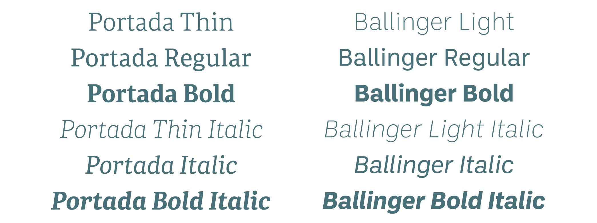
For the brand typeface, we chose Portada – a comforting serif family of letterforms that features an almost tree-like branching and root-like stability that is grounded at the feet. To complement, we chose Ballinger– a sans serif whose solid and balanced strokes provide practicality.
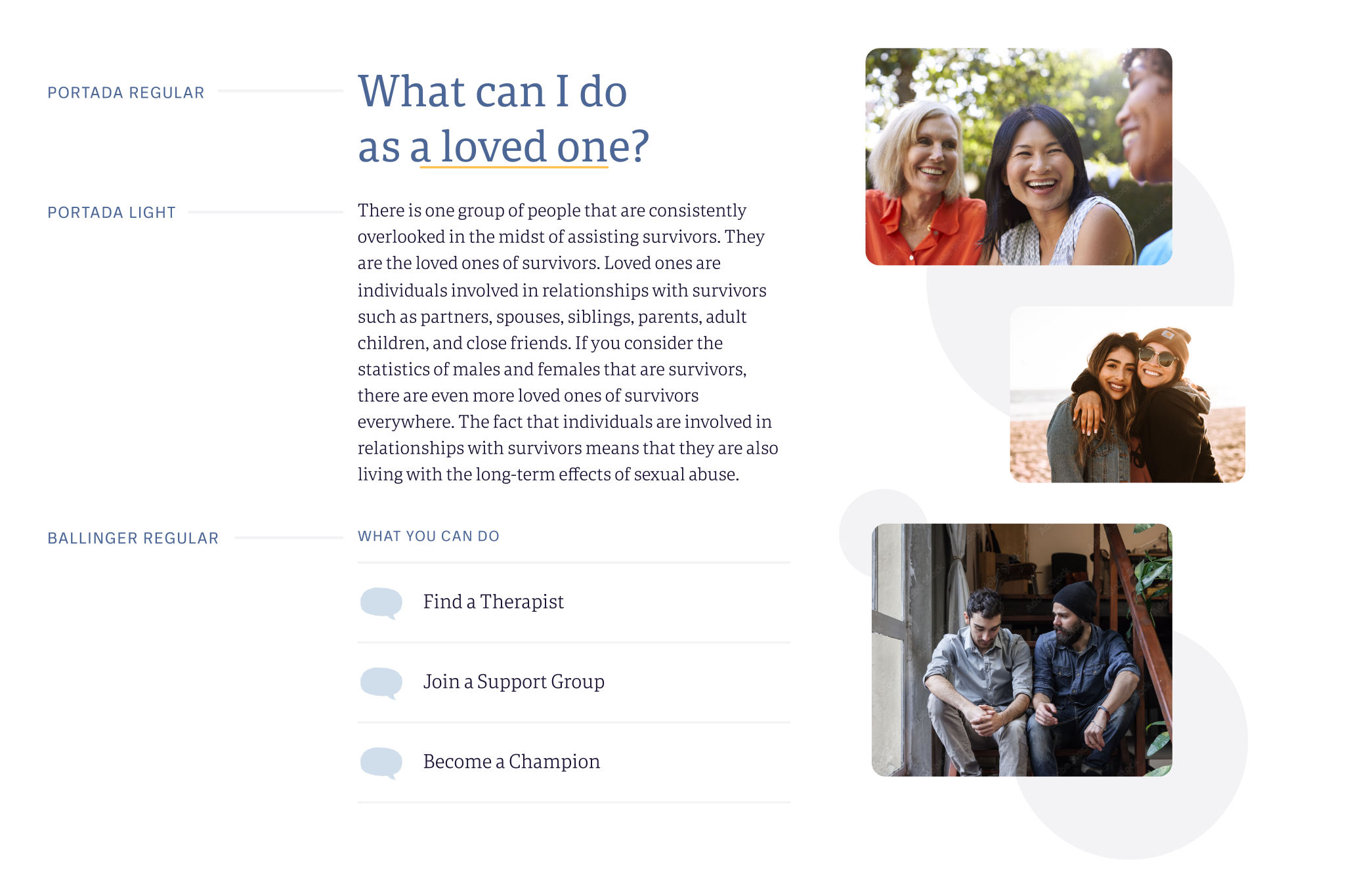
Healing is both an individual and collective experience.
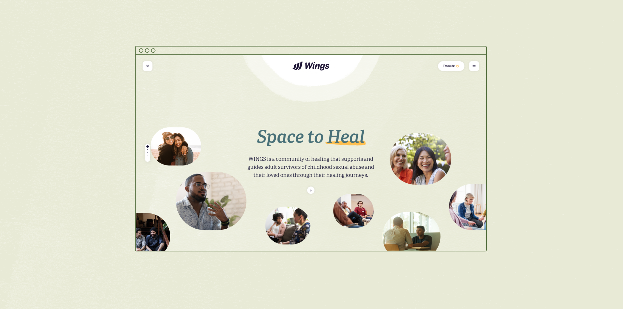
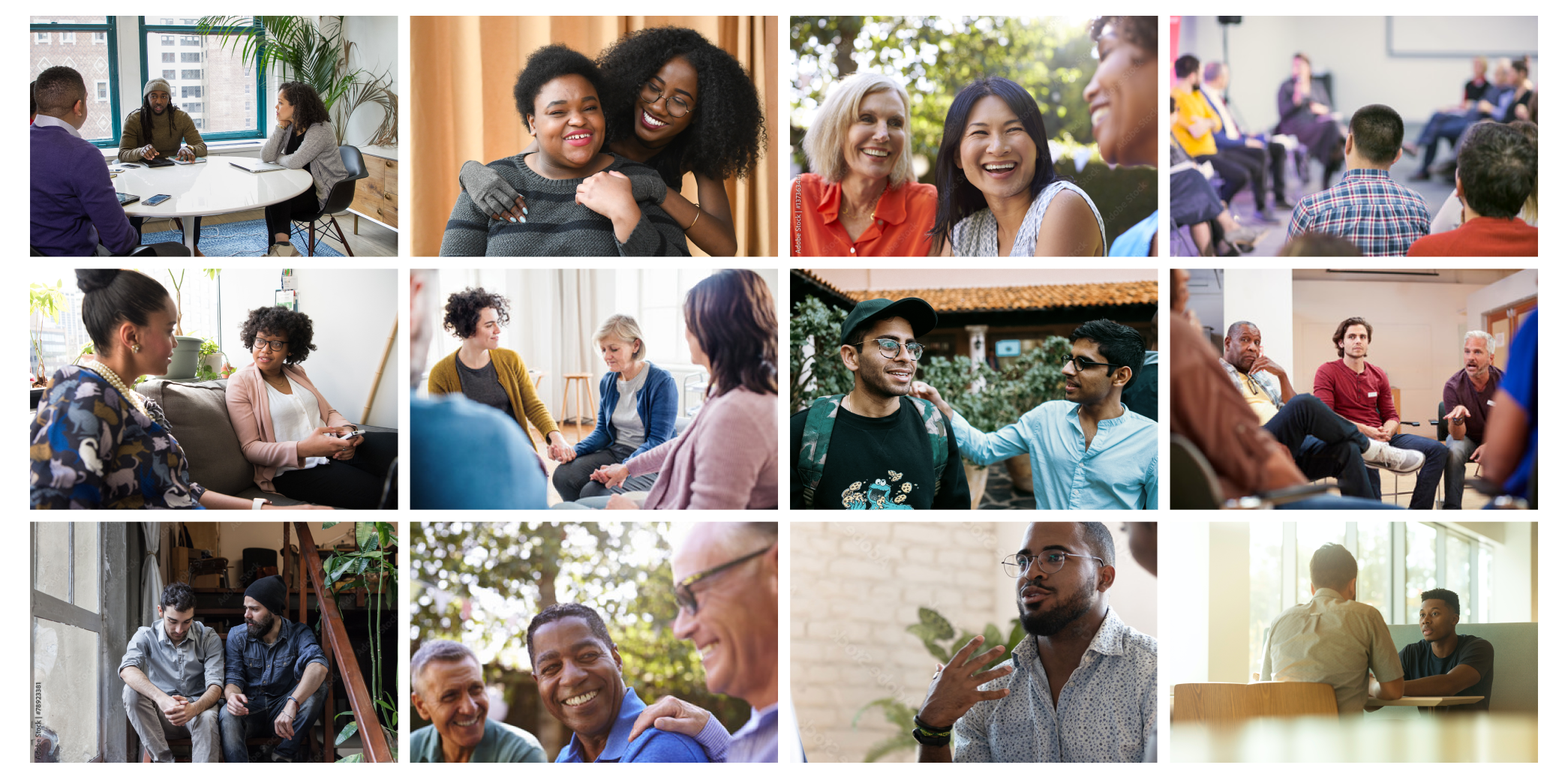
WINGS approaches healing as both an individual and collective experience. The brand needed to speak to their work in centering the needs of adult survivors while helping them create systems of support. This comes through in the photo and illustration direction– people are shown within their community, while birds are depicted flying within their flock.
Most importantly, healing is possible.
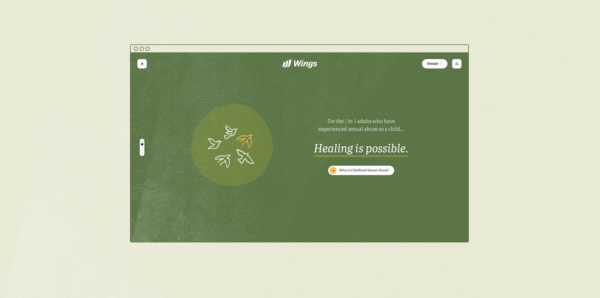
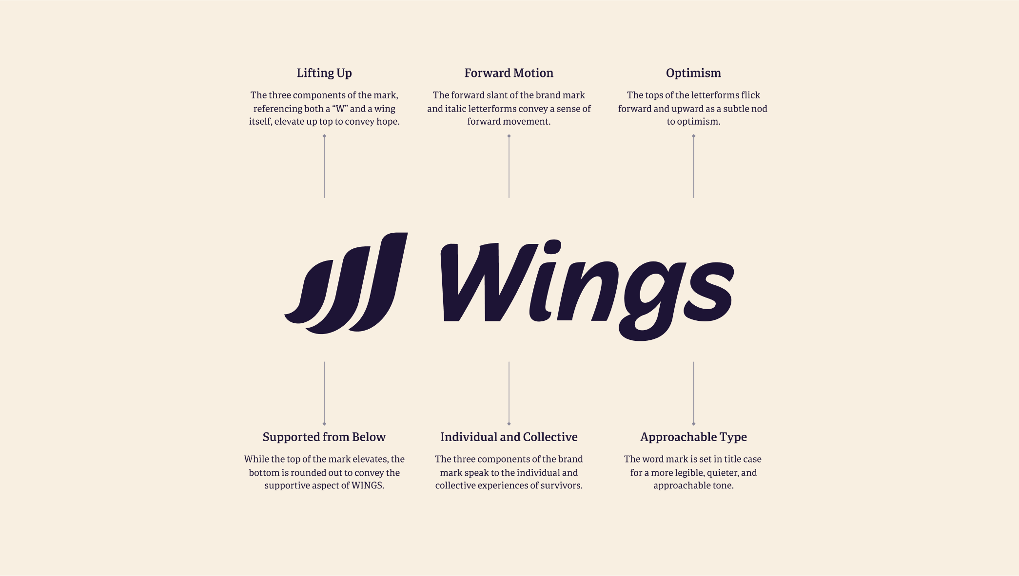
Since the nature of WINGS’ work with survivors can be on the heavier side, we wanted to make sure the brand also expresses hope, strength, and uplifting energy. Birds are drawn flying upward and/or forward. Open, airy layouts and bright photography convey a light optimism. The shapes and forms in the newly drawn logo practice these intentions as well.
Pacing the user experience with moments of pause and patient language.
One of WINGS’ core offerings is their peer support group– however, not everyone who finds WINGS may be ready to join one right away. Someone may first want to learn more about CSA, see whether they identify as a survivor and/or find the right provider.
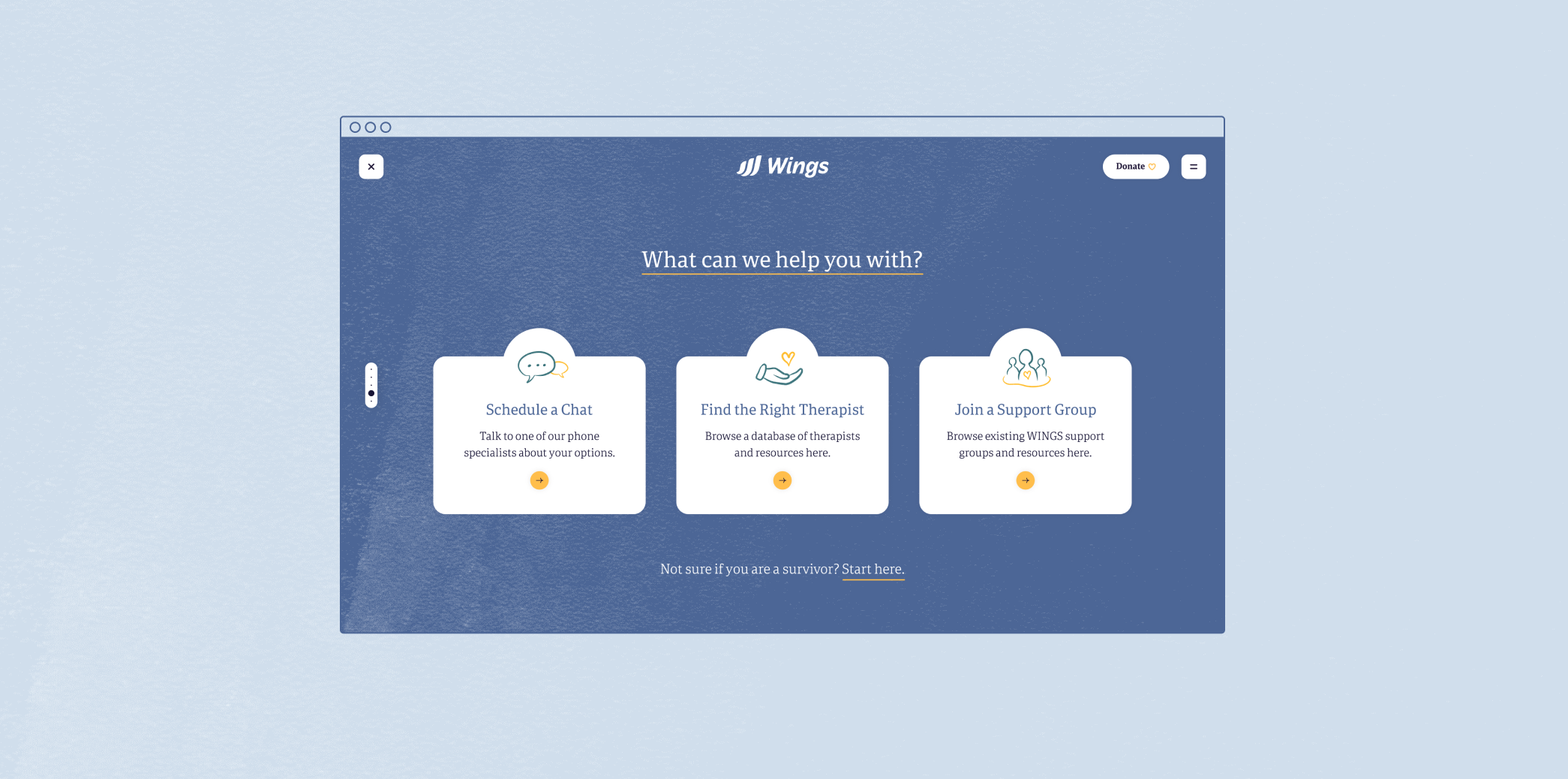
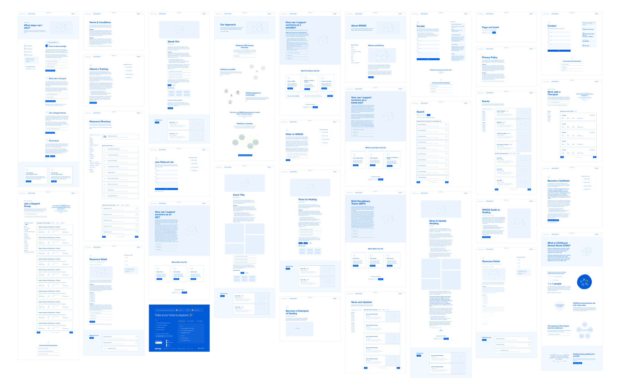
Therefore, we set out to create a paced user experience that considers survivor readiness– one that anticipates people coming from different points on their healing journey. The website needed to accompany users on their learning journeys; while providing pathways to actions that can be taken for when the time is right.
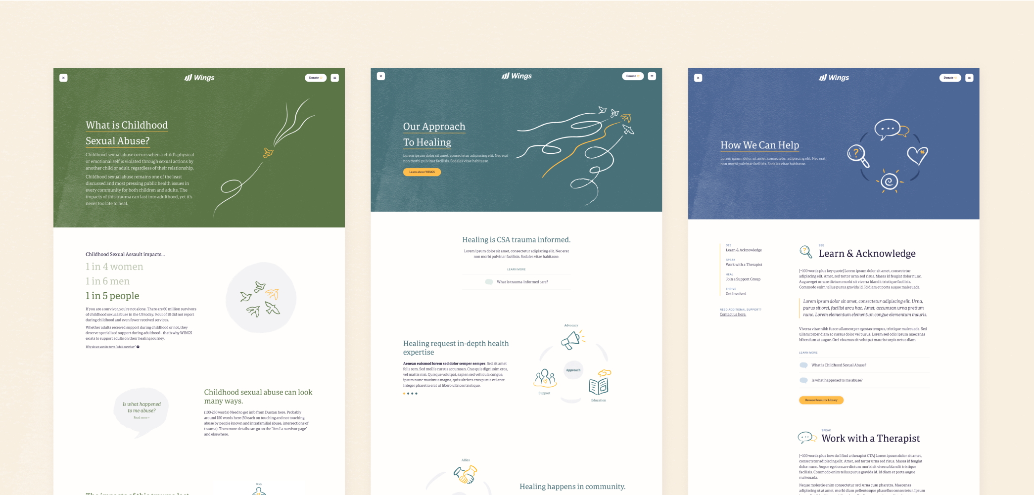
While putting survivors’ informational needs first, the user experience also needed to account for audiences who may not identify as a survivor, but exist as part of a survivor’s larger system of support. No matter who you are, there is something at WINGS for you – whether you are a survivor, loved, provider, and/or ally.
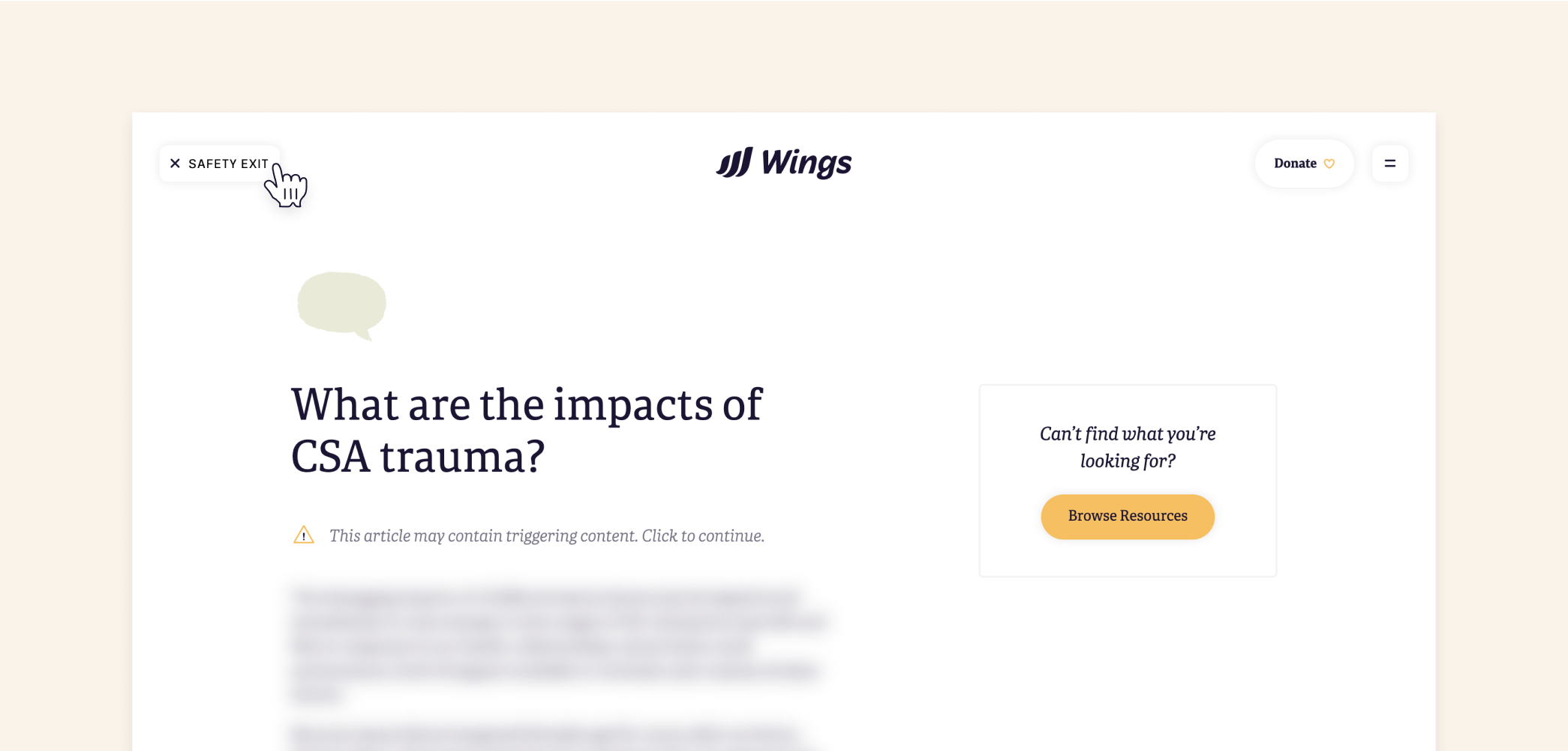
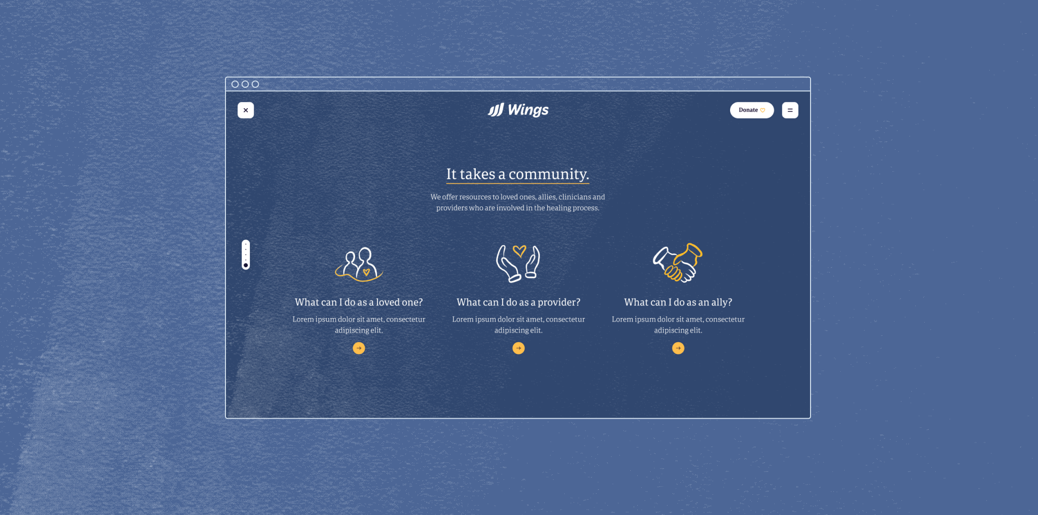
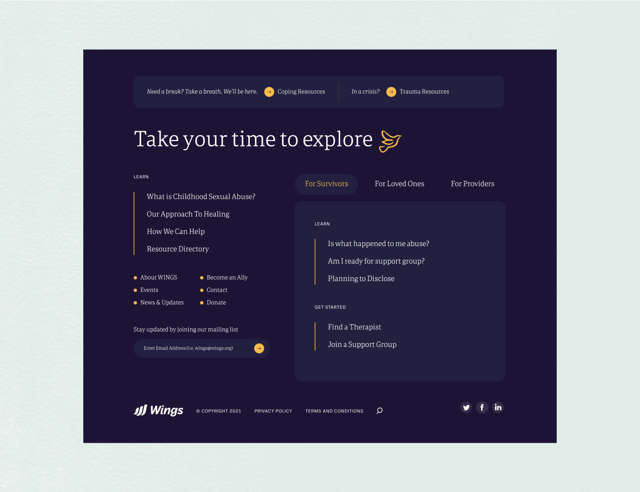
Due to the sensitive nature of the content, the user experience needed to consider safety. Measures such as the safety exit and trigger warnings were implemented. Coping and crisis resources are readily available in the footer.
Some other design decisions to highlight ✨
-
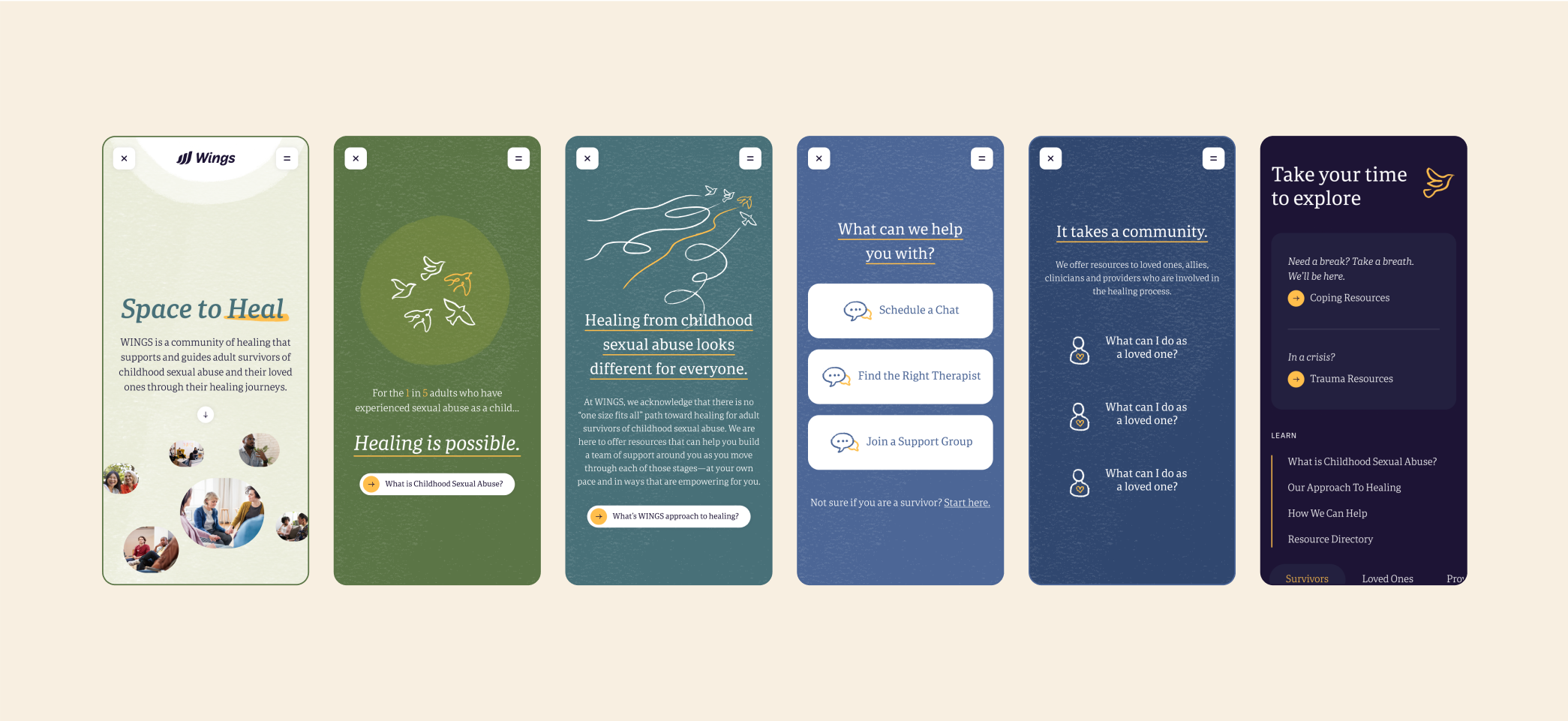
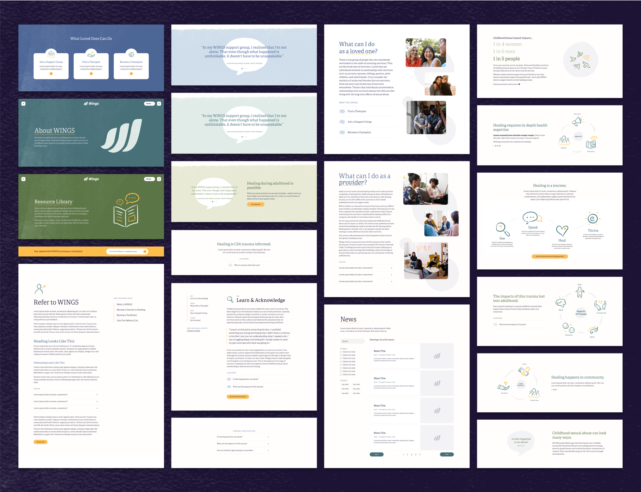
Navigation. Tucking navigational links into a hamburger menu in order to center the user's focus on in-page-body content, while also creating opportunities on page to horizontally navigate the site
-
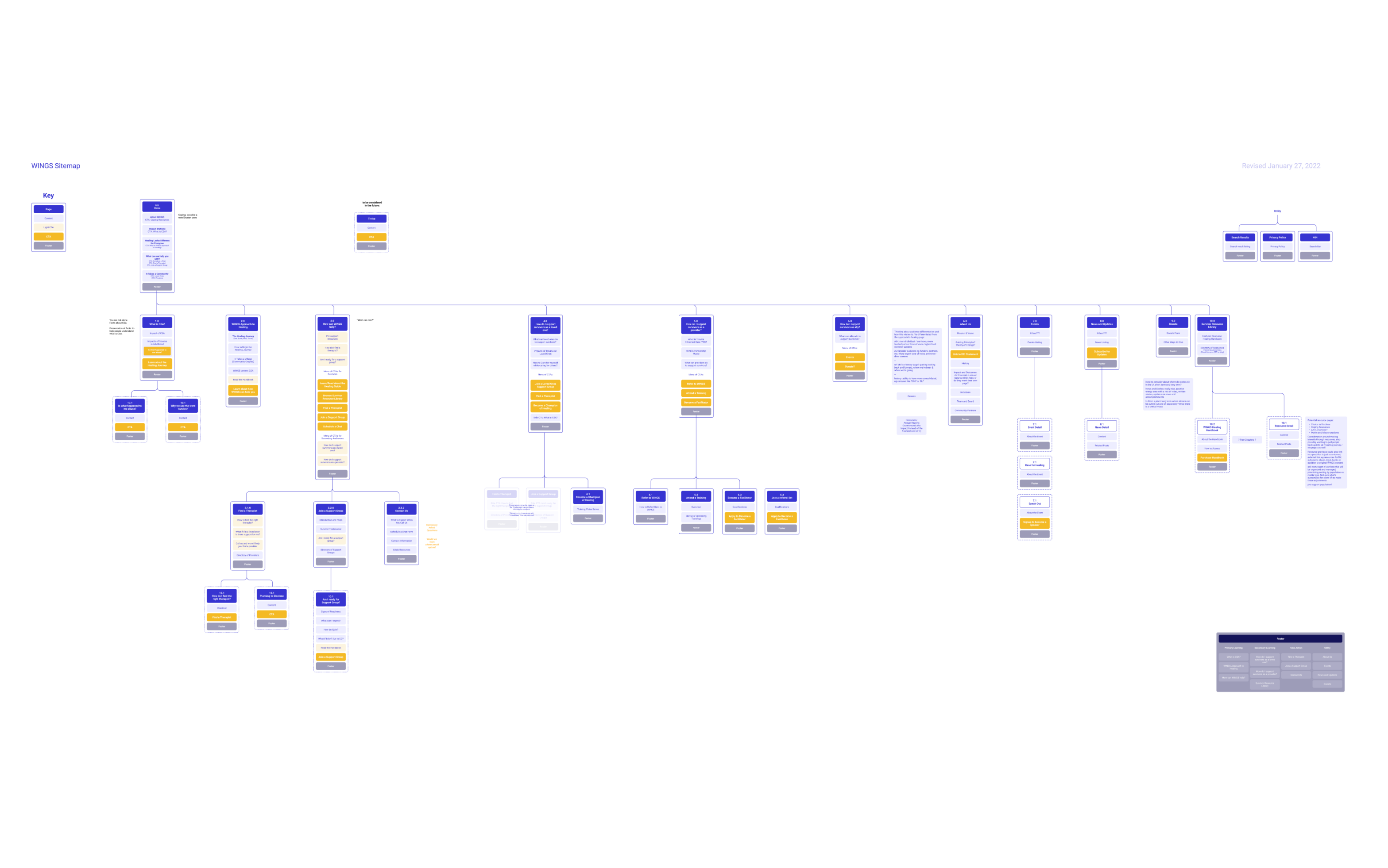
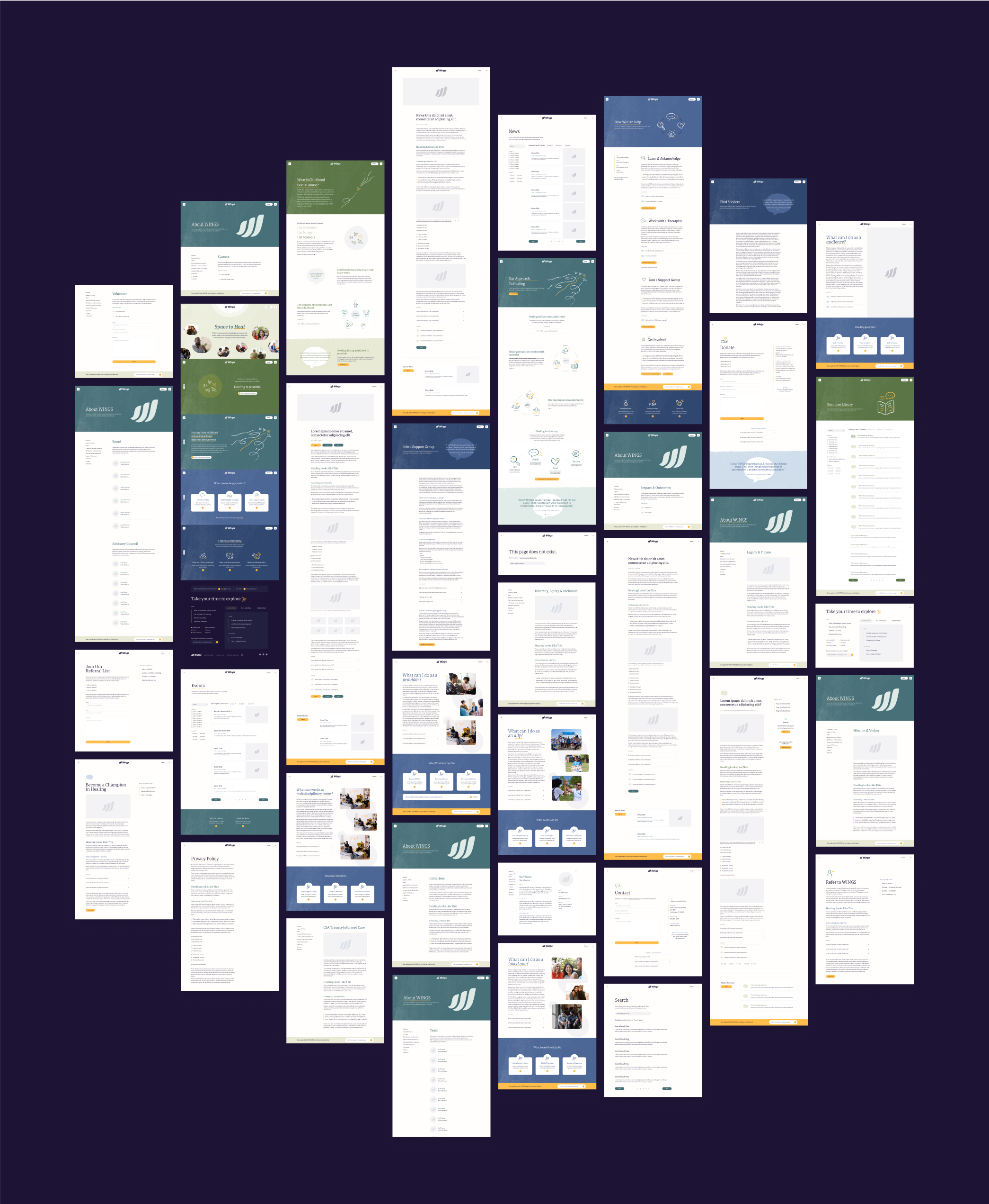
Flow and ordering. Inspired by WINGS' healing approach (See, Speak, Heal, Thrive), our information architecture put forth learning and educational resources first, followed by ways to engage and get support
-
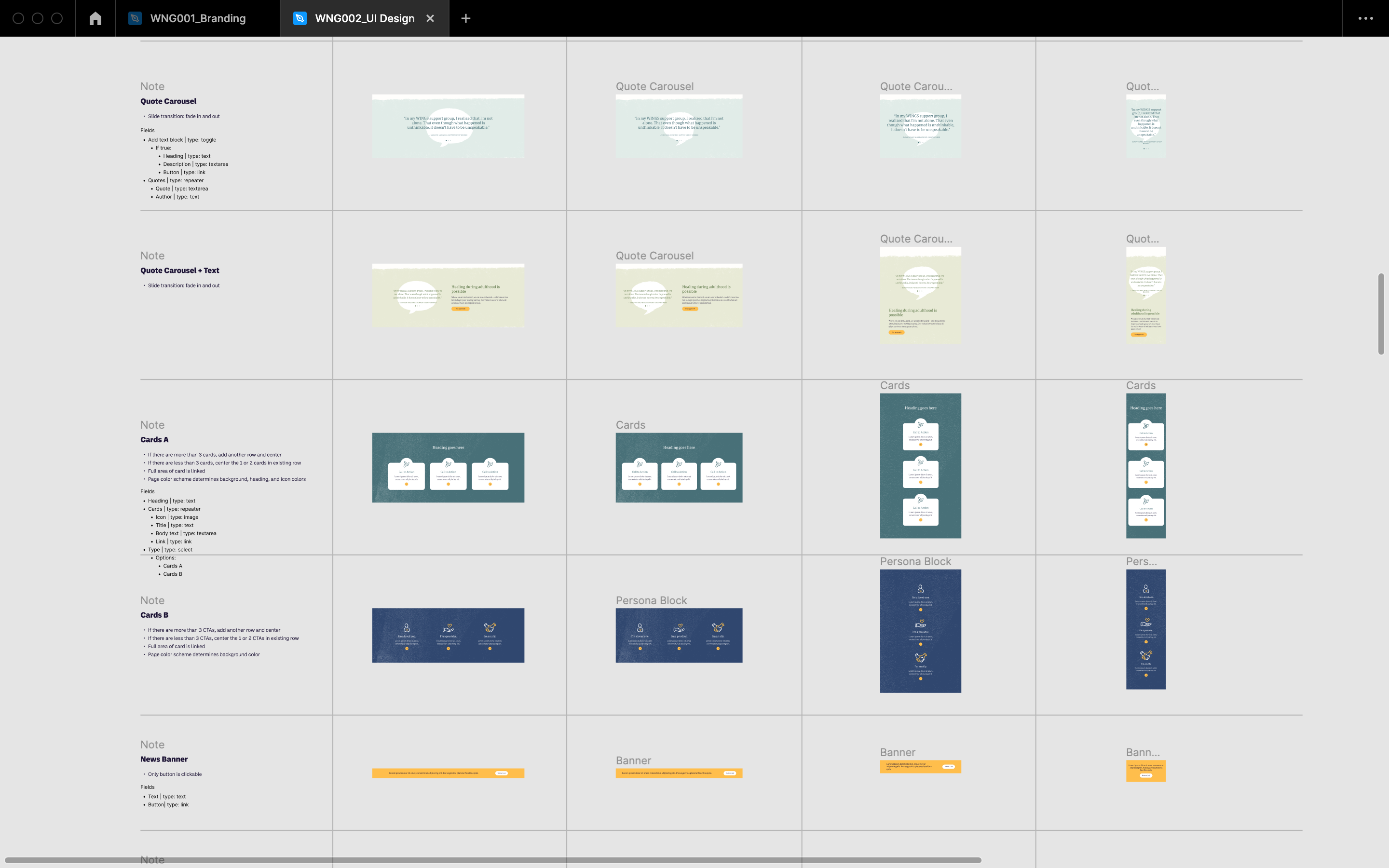
Color Coding. We created a loose color scheming system for coding content: green for educational content (i.e. 'Resource Library', 'What is CSA?'), teal for WINGS' as an organization content (i.e. 'WINGS' Approach to Healing', 'Mission and Vision'), and blue for action-oriented content (i.e. 'How We Can Help', 'Join a Support Group'). This decision acted as a functional application of the brand palette.
