Studio Website
with GHD Partners
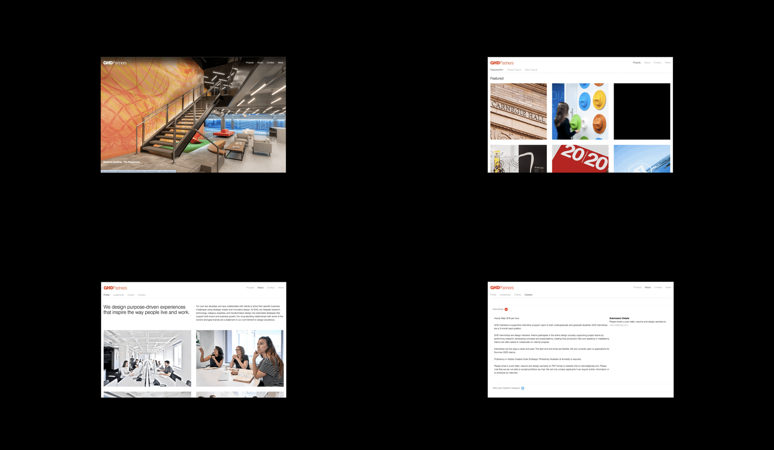
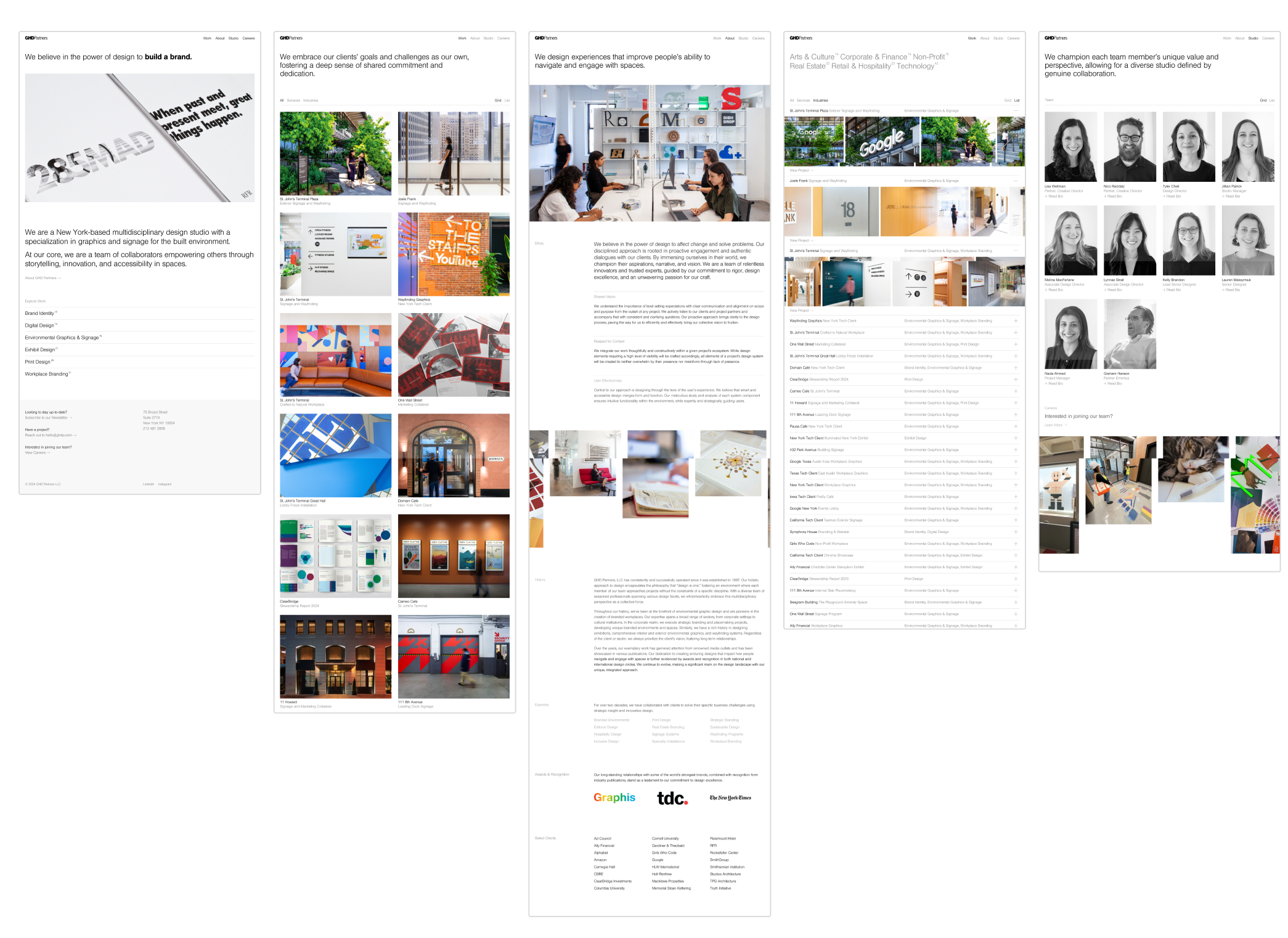
At GHDP, I collaborated with my team to refresh the studio's decade-old website. Our goals were to:
-
Create a digital portfolio showcasing the agency’s expertise and decades of work.
-
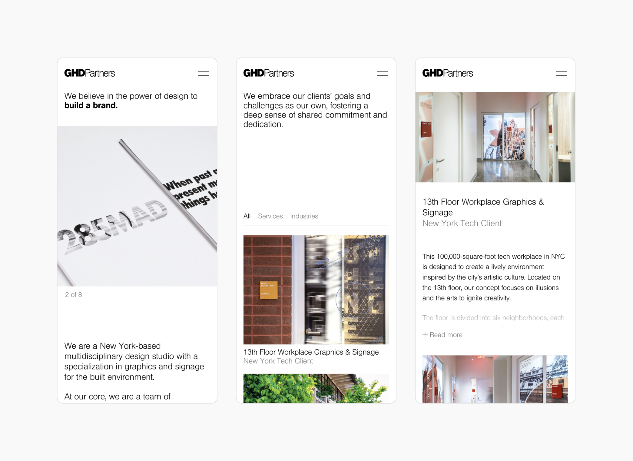
Standardize grids, templates, and image ratios into a robust design system, while incorporating responsive, dynamic layouts.
-
Improve the usability of the backend content management system.
-
Ensure the design meets web accessibility standards.
Bringing Function to the Forefront
Functionality and ease of navigation were central to our approach. Instead of hiding filters in a dropdown menu, we showcased them as prominent typographic elements. This achieved two goals: enhancing user navigation and clearly communicating the studio's services and areas of expertise.
We introduced typographic contrast by adding a small numeric annotation to each filter. This numeral informs users of the project count while serving as a visual separator between tags.
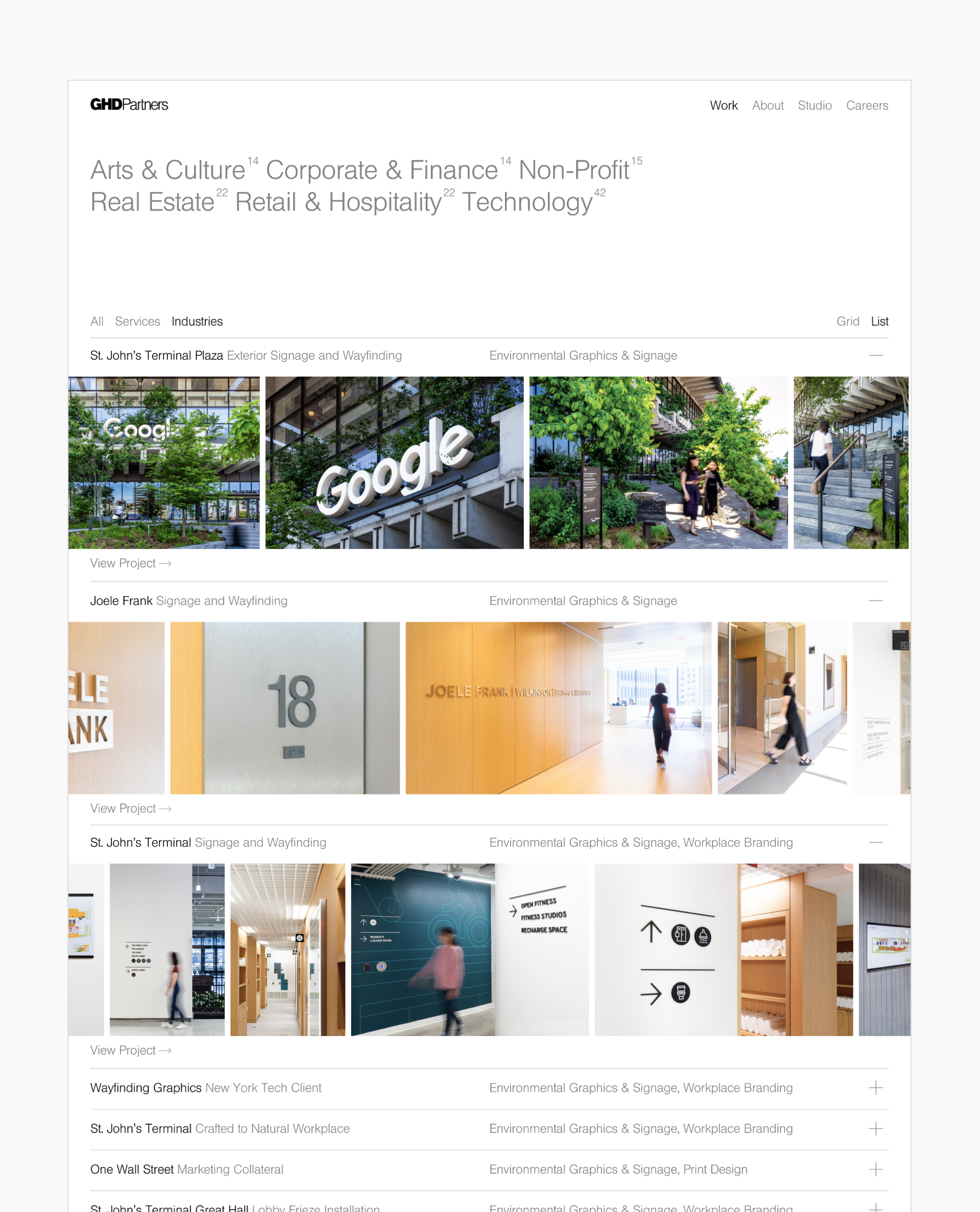
Offering both grid and list views for project navigation provides users with diverse experiences. In the list view, we implemented a horizontal scroll with images on the project detail page for added engagement. See full experience here.
Smooth transitions enable users to move seamlessly between project pages, creating a unified browsing experience.
Creating movement and fun moments of interactivity
We incorporated subtle, playful easter egg moments to reflect the studio's creative portfolio. These include responsive cursor changes on the home page, a text bounce animation in the footer, and a rotating image thumbnail that appears on hover.
A contemporary palette with a hint of red
We minimized the use of the original brand red to serve a more specific and functional role, such as in hover effects and subtle accents. Instead, color is emphasized through photography.

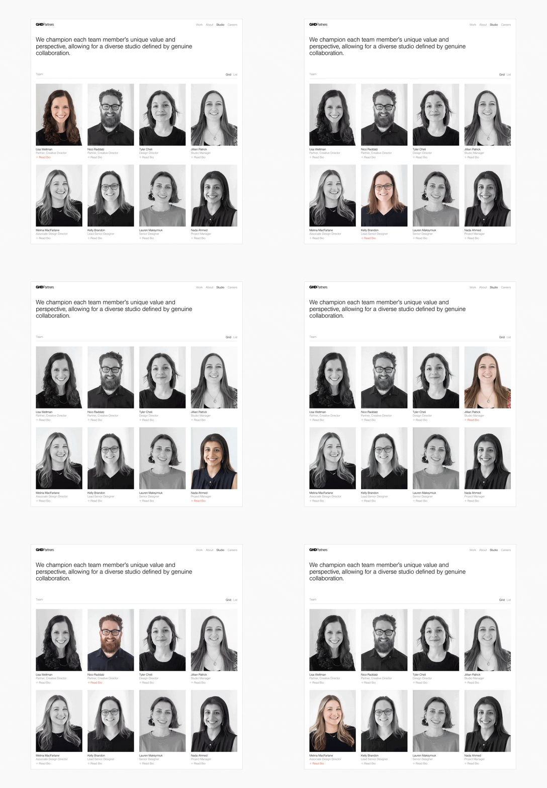
The result is a modern, user-friendly website that not only highlights GHDP's expertise and creativity but also provides a seamless and accessible experience for all users, compared to its predecessor.
