Capturing the Spirit of Reading
with Barbershop Books
Radish Lab partnered with Barbershop Books to redesign their visual identity and website. Due to rapid organizational expansion, Barbershop Books needed a new digital presence that they could not only grow with, but also use to speak to their key audiences: barbershops, families, schools and libraries, funders, and community organizers.
In my role as UX and UI designer, I worked alongside my team and Alvin Irby, Founder & Executive Director (a.k.a. Chief Reading Inspirer) of Barbershop Books to design (1) a visual identity that captures the organization’s mission to inspire through reading, and (2) a website experience that speaks to their key audiences.
About the Client
Barbershop Books is a nonprofit organization with a mission is to inspire Black boys and other vulnerable children to read for fun through child-centered, culturally responsive, and community-based programming and content.
Collaborators
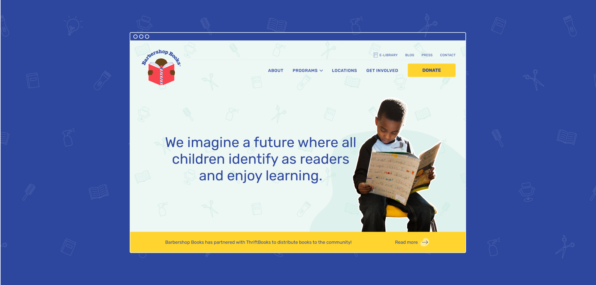
Visually balancing a playful spirit with a mature ambition
Barbershop Books makes reading fun– so we wanted the visual identity to convey the joy of being immersed in a good story. While leaning into imaginative expressions, the identity also needed to position Barbershop Books in a way that encourage the development of new partnerships and programs. The identity needed to embody Barbershop Books' resolve and commitment to addressing to larger, systemic issues around access to educational opportunities in Black communities.
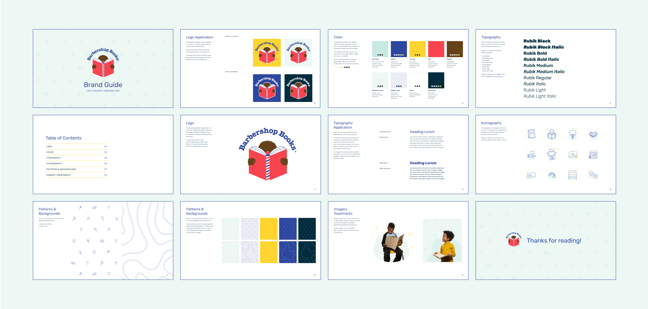
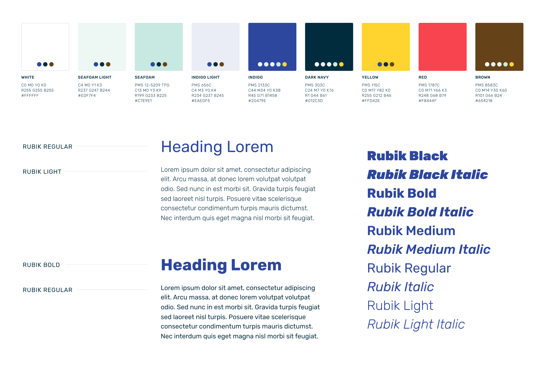
Catering to the balance through color and typography
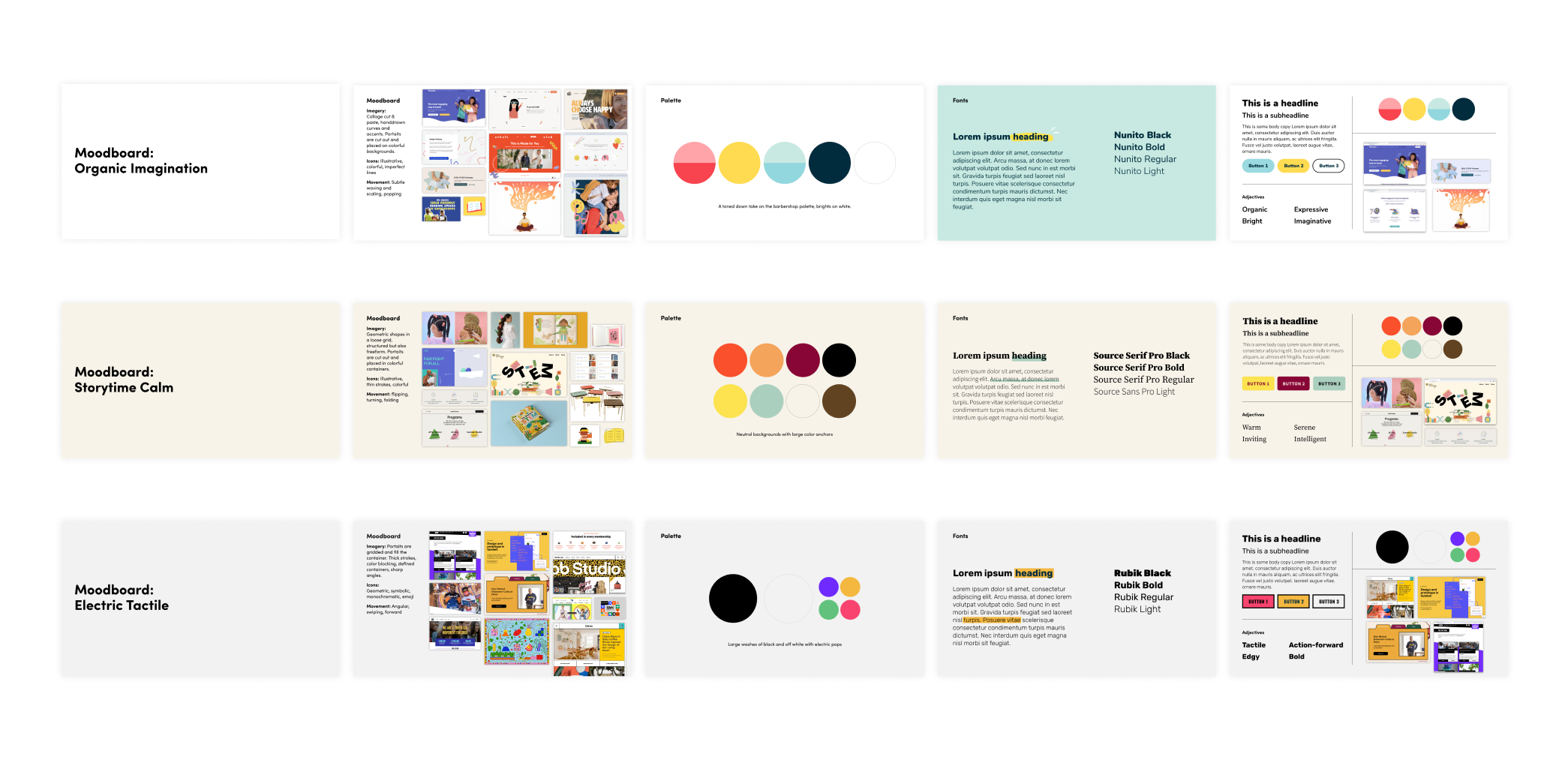
We built a color palette around the saturated tones of indigo blue, sunny yellow, and a punchy red. While these colors are inspired by the visual language around barbershops, youth and education, they can feel heavy-handed on their own. Therefore, we lightened up the selection with paler hues of seafoam green and indigo.
For typography, we chose Rubik: a tactile and inviting typeface which reflects our client’s nature in how they interact with not only the children they serve, but also the people they partner with. Rubik features stout letterforms that are playful and sturdy. Rubik offers a flexible selection of weights, which comes in handy when adjusting to either a playful or serious tone of use.
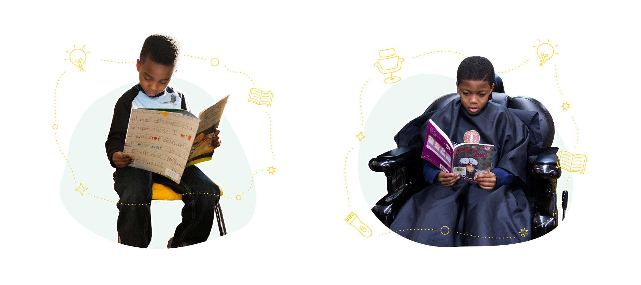
Culturally relevant graphics and imagery
Barbershop Books encourages Black children to identify as readers – therefore, it was vital to show imagery of Black kids actively reading in spaces where they would normally be in. To highlight how reading activates imagination, we pulled inspiration from space and constellations.
Patterns weave together themes of hair and reading. Icons depict an arrangement of tools found in barbershops such as hot combs, clippers, etc.

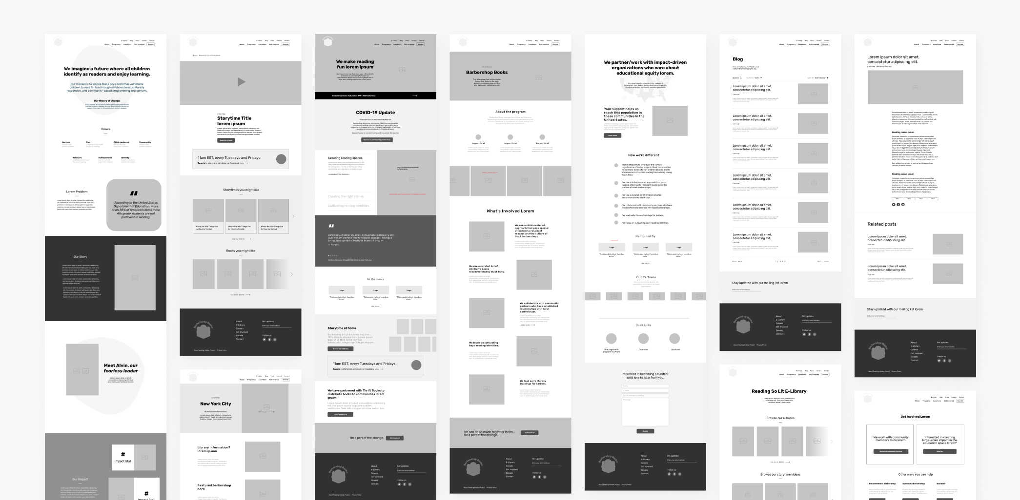
We designed a user experience that aimed to...
-
Generate excitement around Barbershop Books' mission by showing reach and impact
-
Illustrate what programmatic offerings look like and how to get involved
-
Encourage families to engage with and contribute to e-library content
-
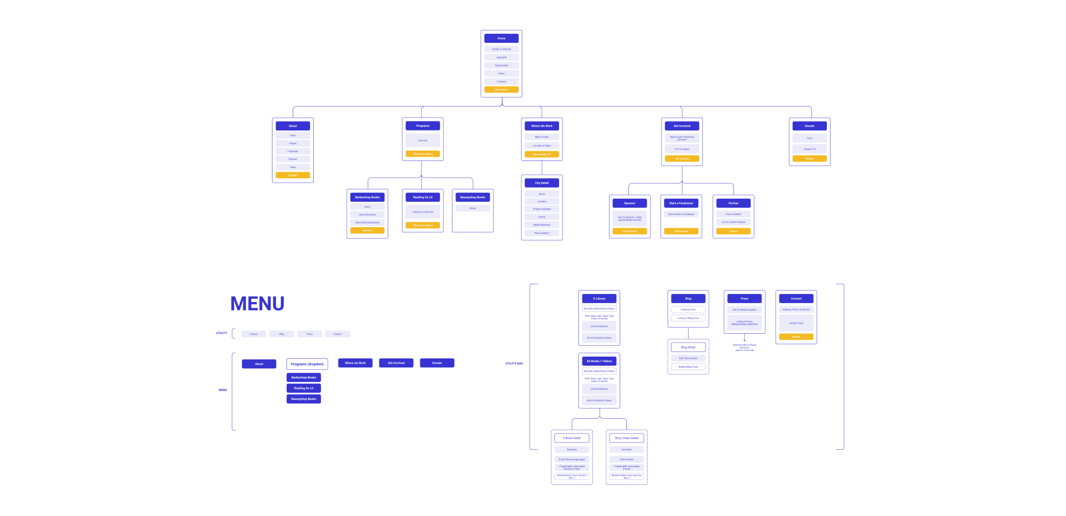
Provide clear pathways for barbershops, families, schools and libraries, funders, and community organizers to get involved

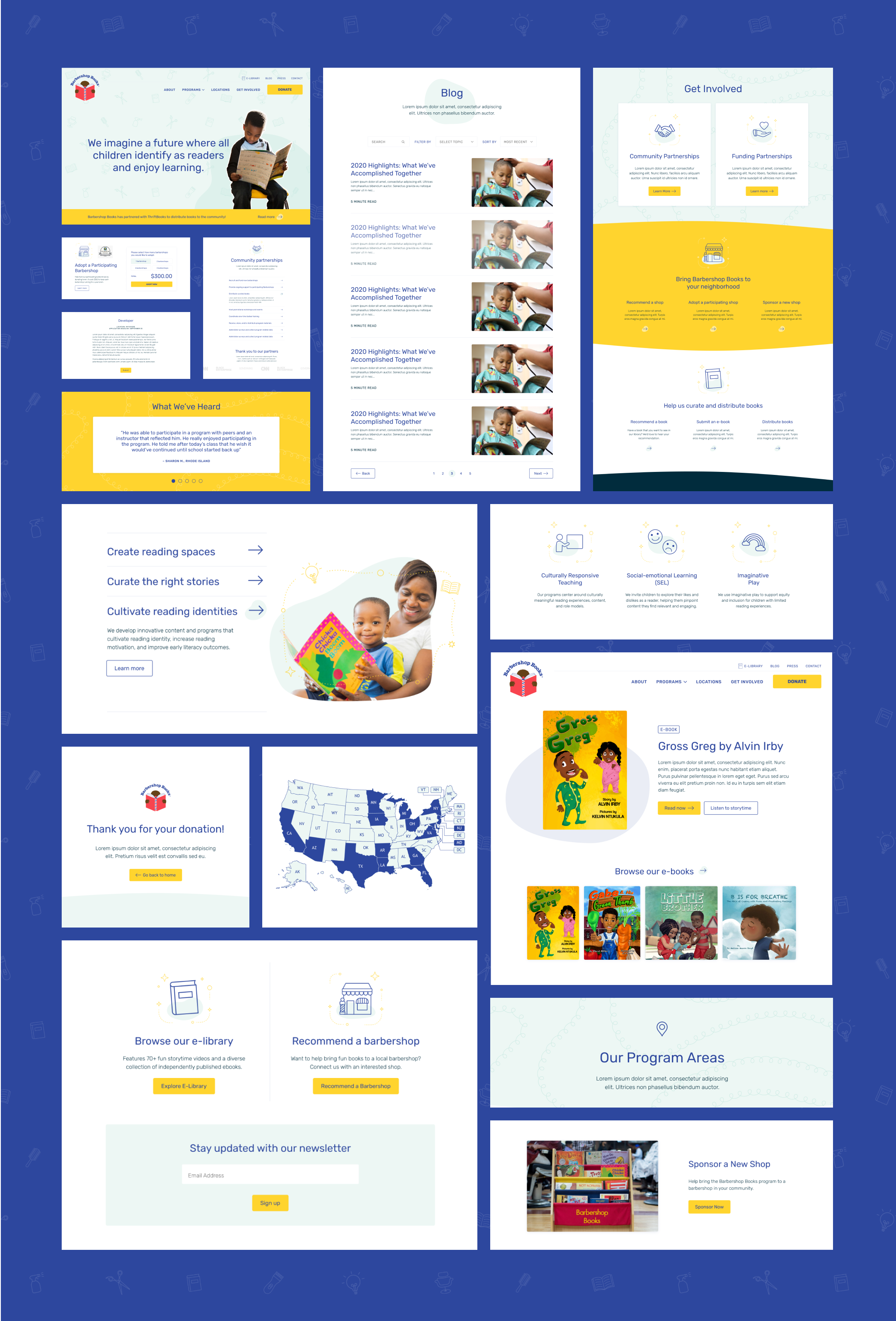
Here are a few design decisions to highlight ✨
-
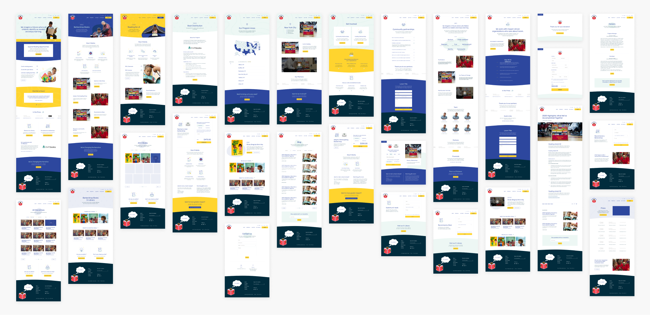
Mission snapshot. We introduced a drawer interaction on the home page that features active language around their mission, while also linking to program pages in order to show how values are put into practice.
-
Building credibility. We designed carousel components that feature 1) media mentions and 2) testimonials from families and barbershops in order to show impact, build trust and credibility.
-
Pathways to getting involved. We placed various calls to action (donate, check out the e-library, and recommend a barbershop) at the end of the home page so users have a clear idea how to engage with the organization after learning about them.
-
Showing, not just telling. We paired language and content with fun icons and imagery of children actively reading in order to tell Barbershop Books' story in an engaging way.
