Designing a Content Editor for an Internal Platform
For Top Public University
I partnered with a team at a public university to improve an internal, web-based platform that supports professional development and learning. The platform serves two main user groups:
-
Administrative users, who create and manage content
-
General users, who view, share, and interact with content
Over six months, I contributed to several design initiatives addressing user needs across the platform. This case study focuses on the following areas:
-
Designing a flexible, responsive content editing experience using the TipTap editor
-
Creating 50+ custom icons to reflect platform-specific content categories
-
Enhancing layouts and imagery templates while aligning the UI with university's updated branding
Note: All imagery uses placeholder content to protect client privacy.
About
This work was done as part of a 6 month contract with a team at a top public university.
Collaborators
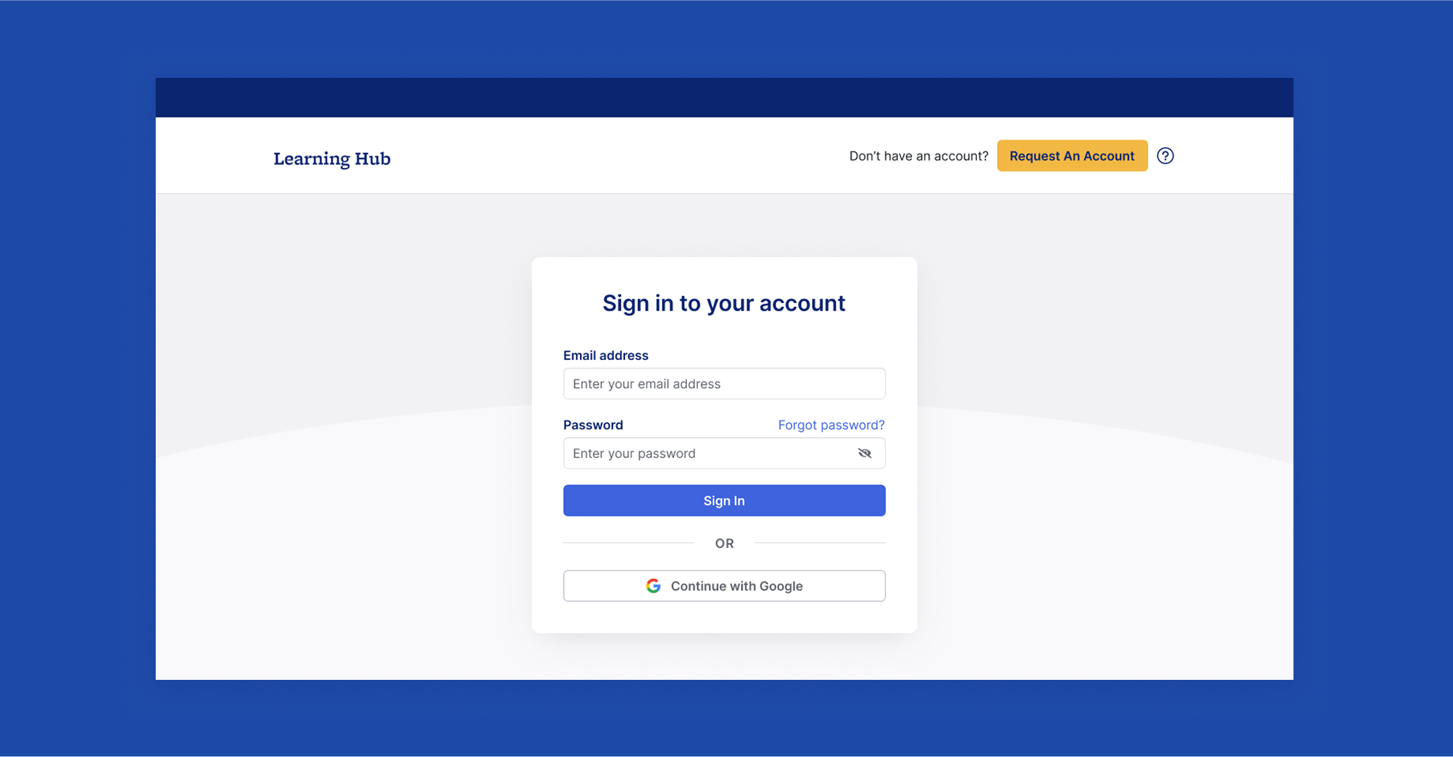
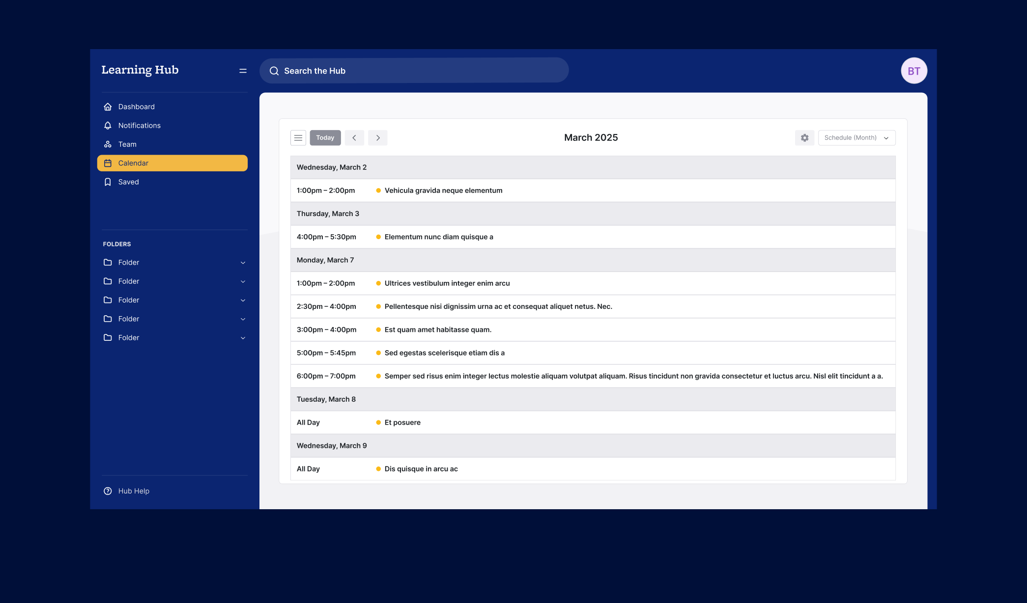
Designing a Flexible Content Editing Experience
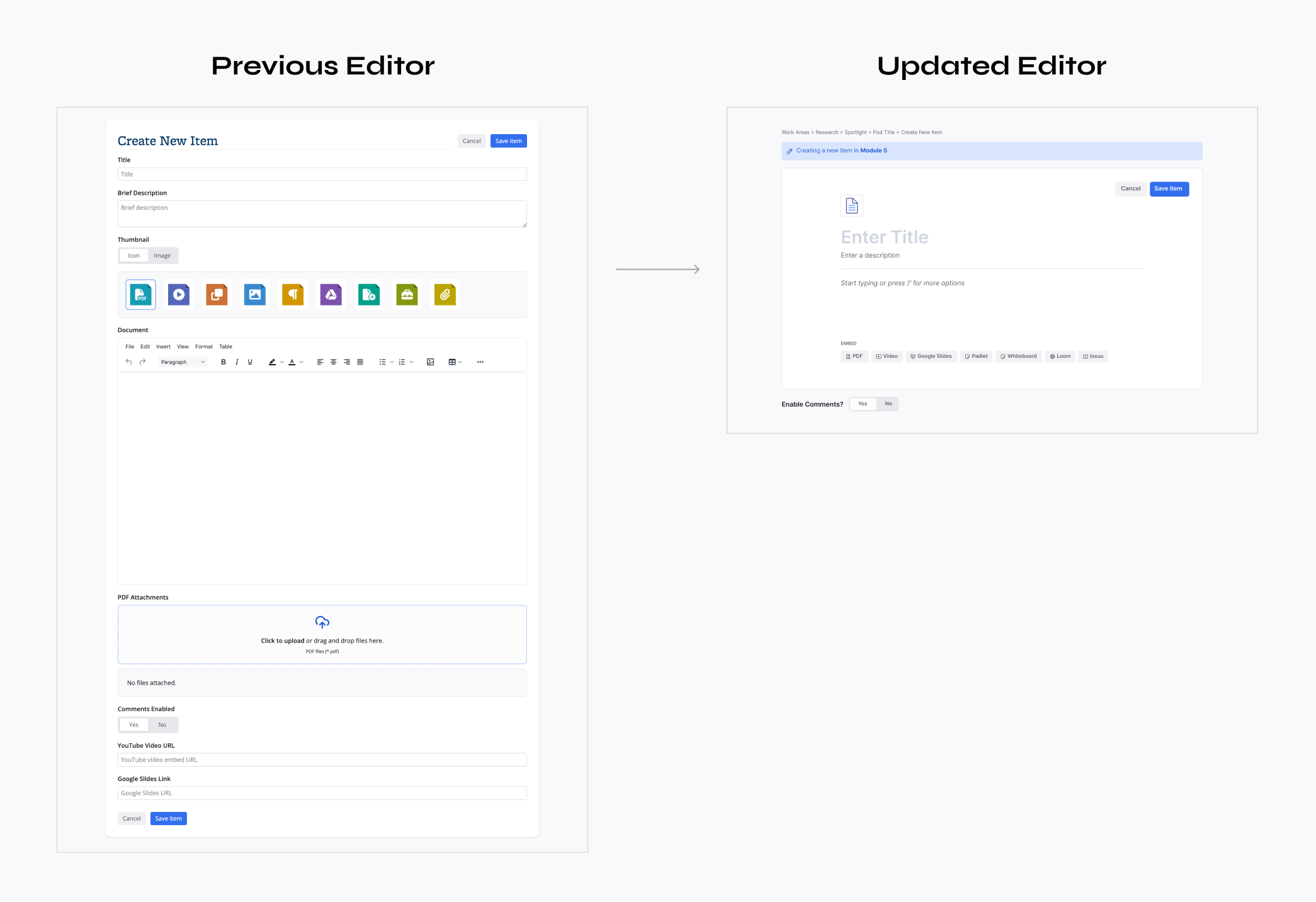
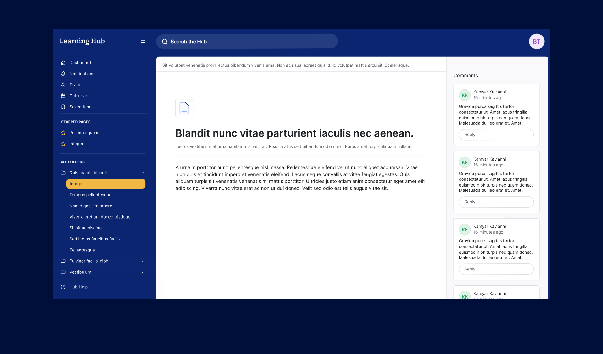
Administrative users needed a more dynamic and intuitive way to create content—something closer to modern tools like Notion or Linear. Their existing editor was static and limited in functionality, making it difficult to reorder content, embed media, or include interactive elements.
To solve this, we introduced a block-based content editor using TipTap. This approach allowed users to:
-
Re-order content
-
Embed multiple PDFs
-
Add interactive whiteboards
-
Tag posts flexibly
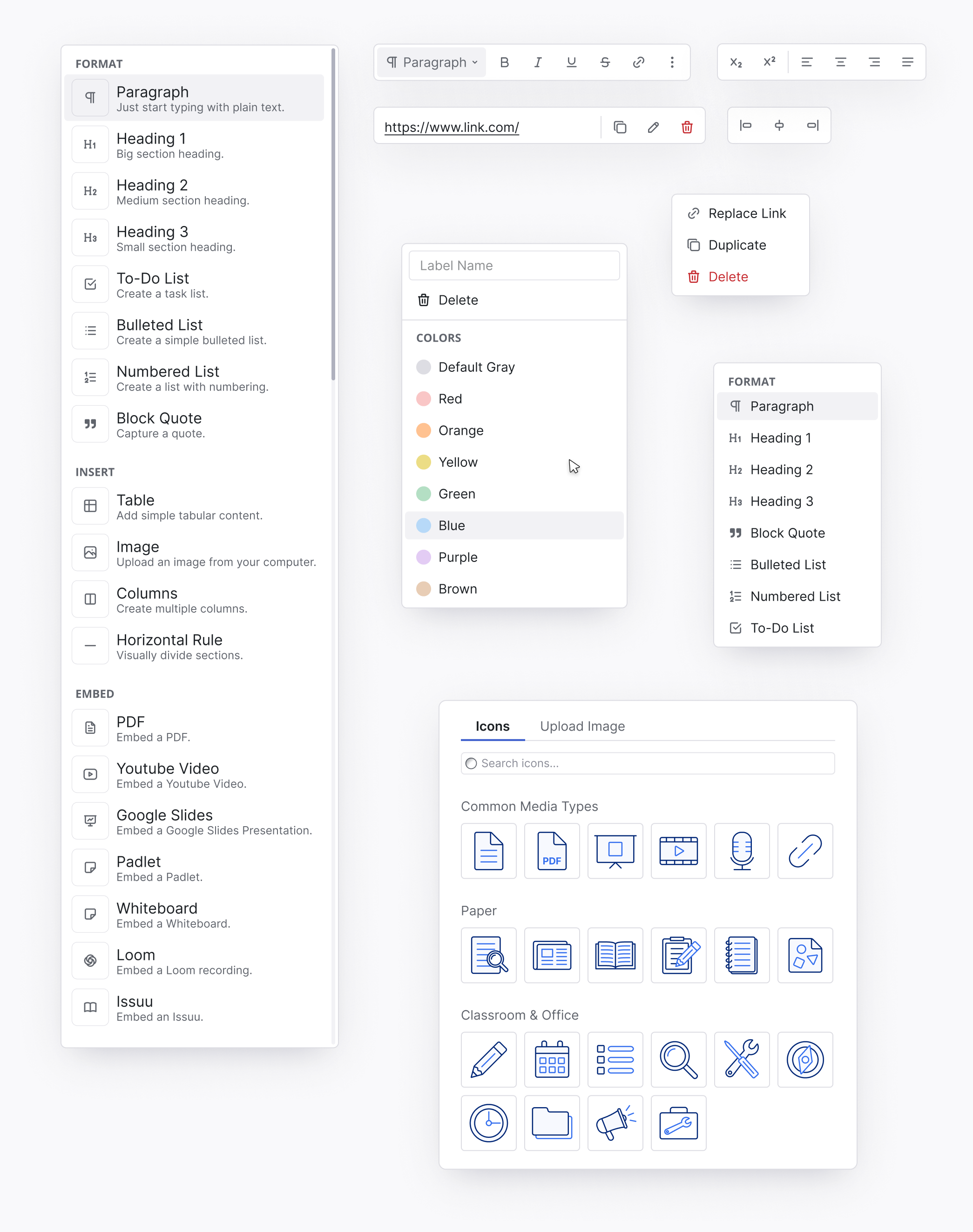
The interface adapts to users’ needs in real time, making the editing process more natural and efficient. I designed a variety of contextual UI elements, including bubble and dropdown menus for specific interactions like:
-
Adding and editing text or links
-
Scaling and aligning images
-
Modifying tables (e.g., adding rows or columns)
-
Inserting new block types
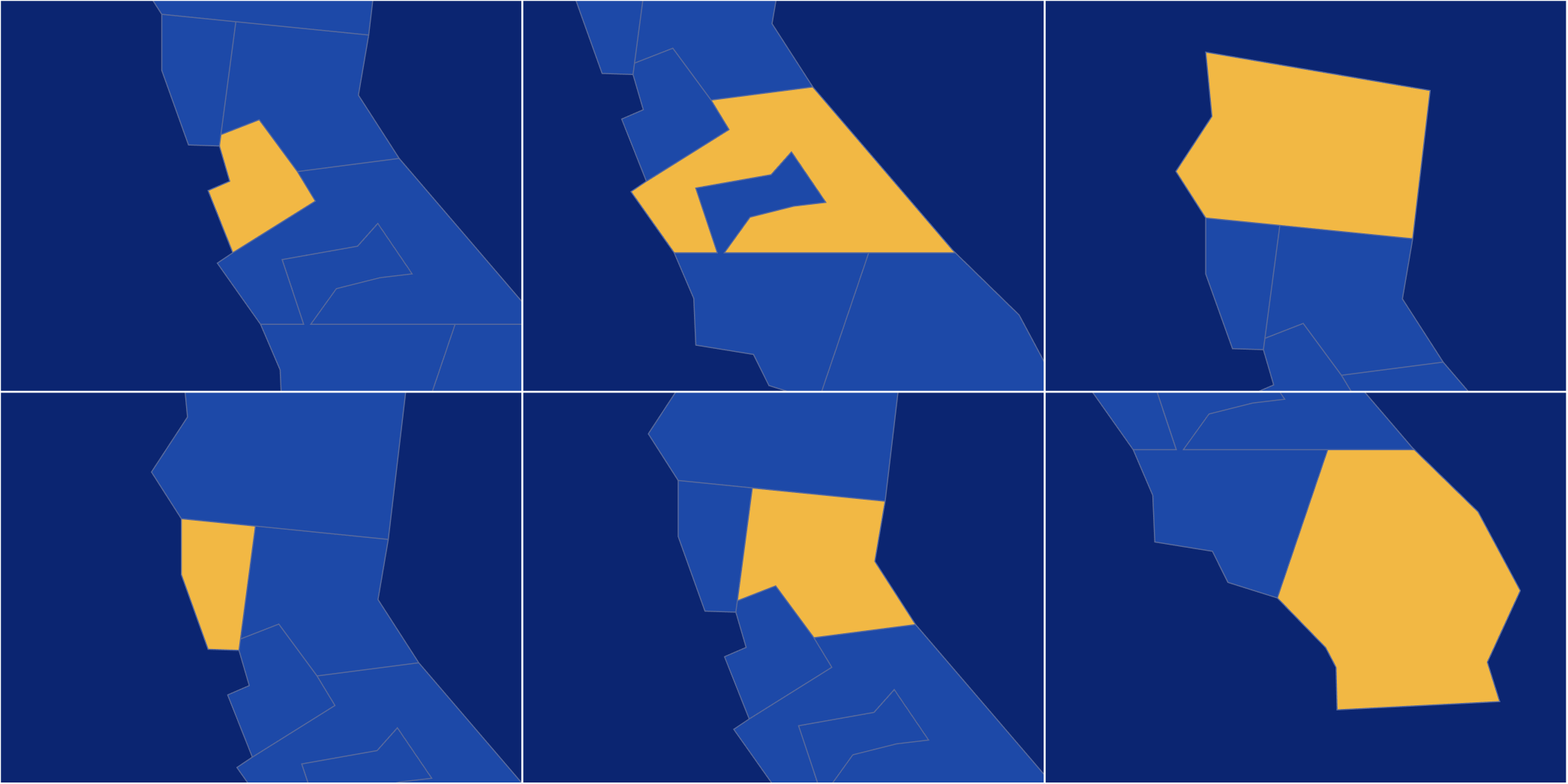
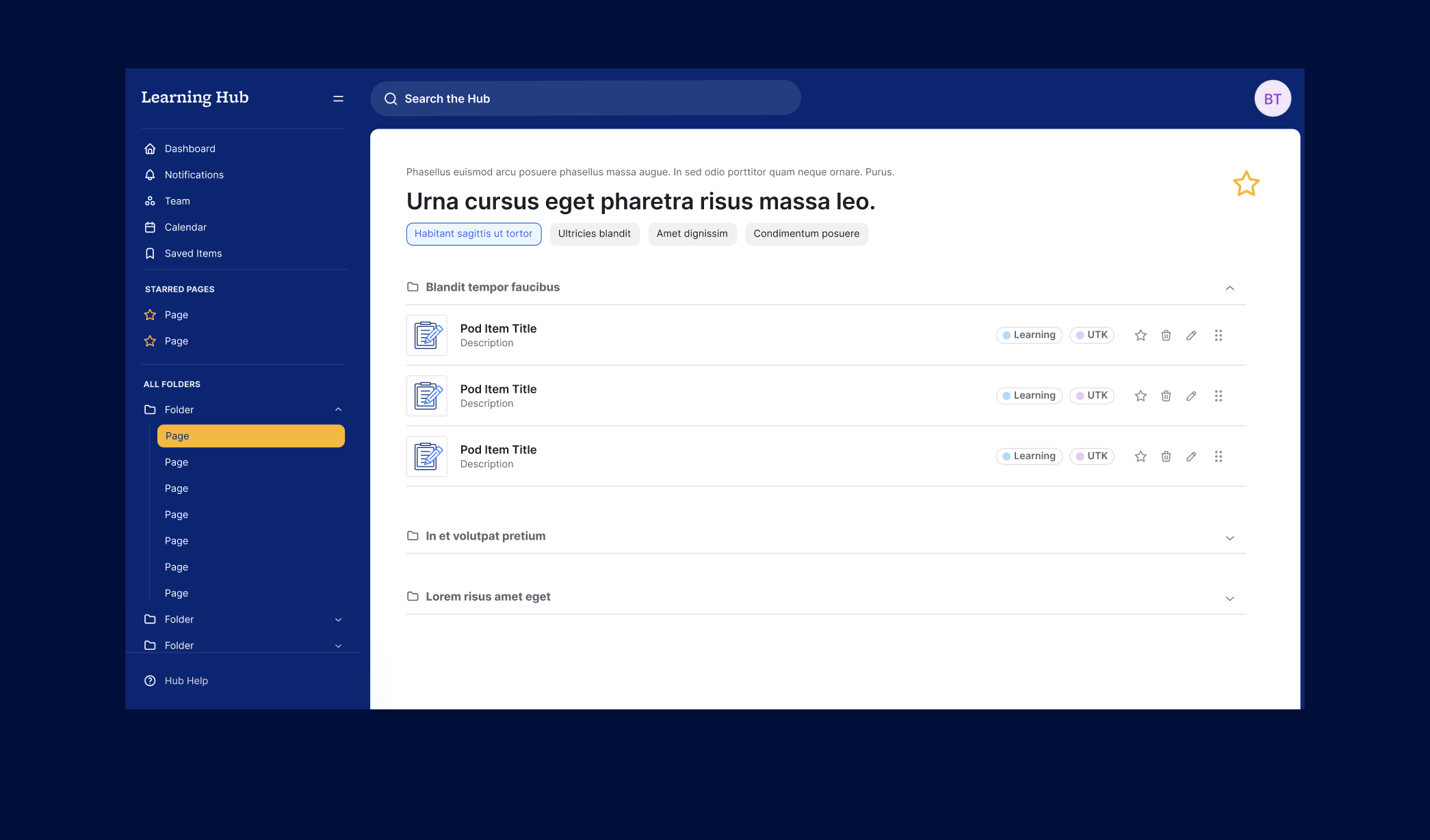
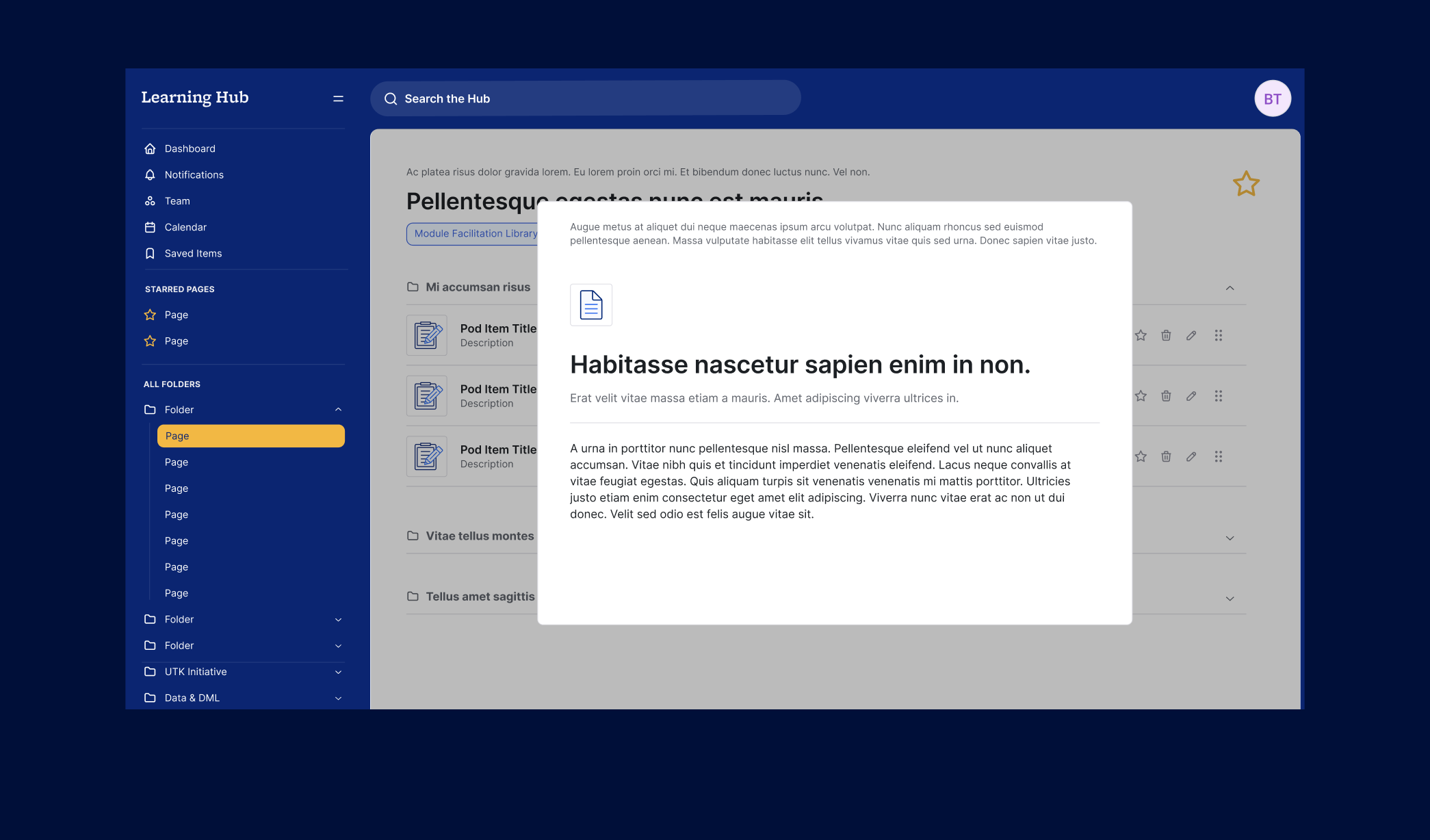
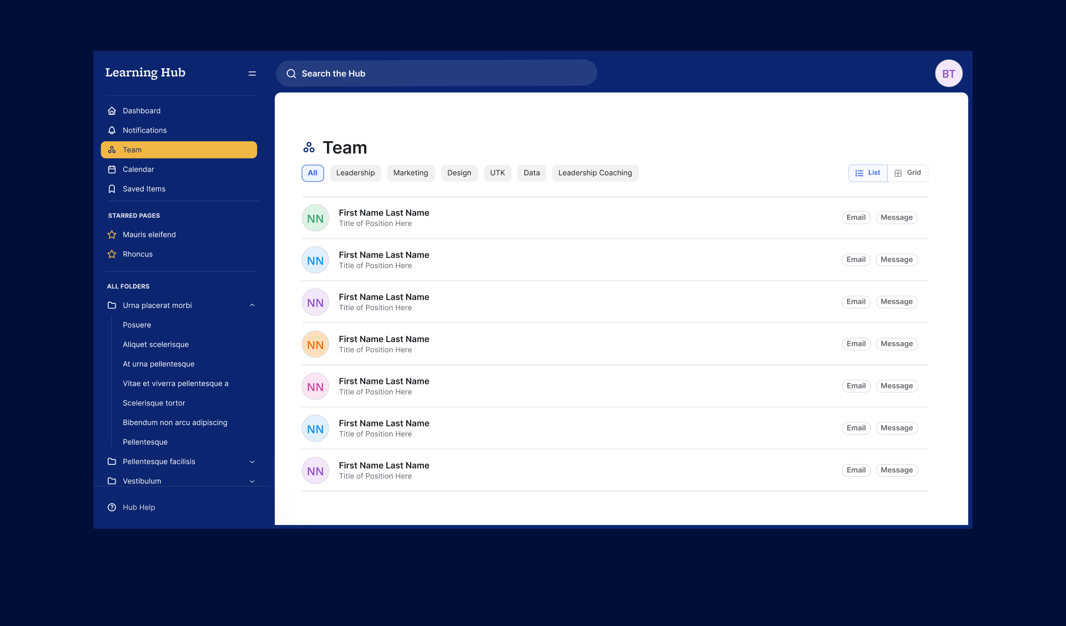
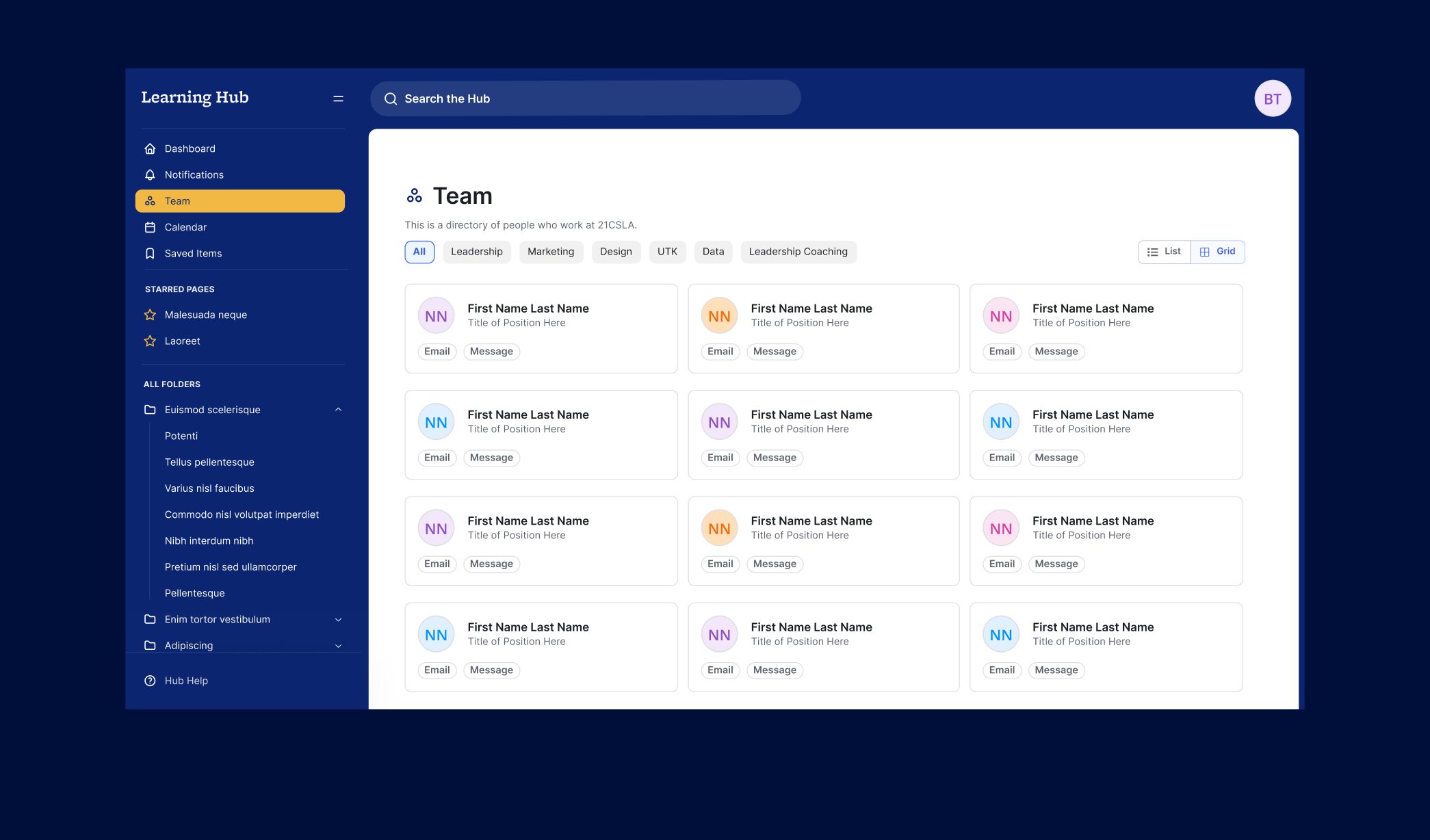
Creating 50+ Custom Icons
To better represent the variety of content on the platform, I conducted a content audit to identify existing categories and usage patterns. Based on the audit, I designed a library of over 50 custom icons tailored to the brand. These icons not only improved visual consistency but also made it easier for users to scan and understand content types at a glance.
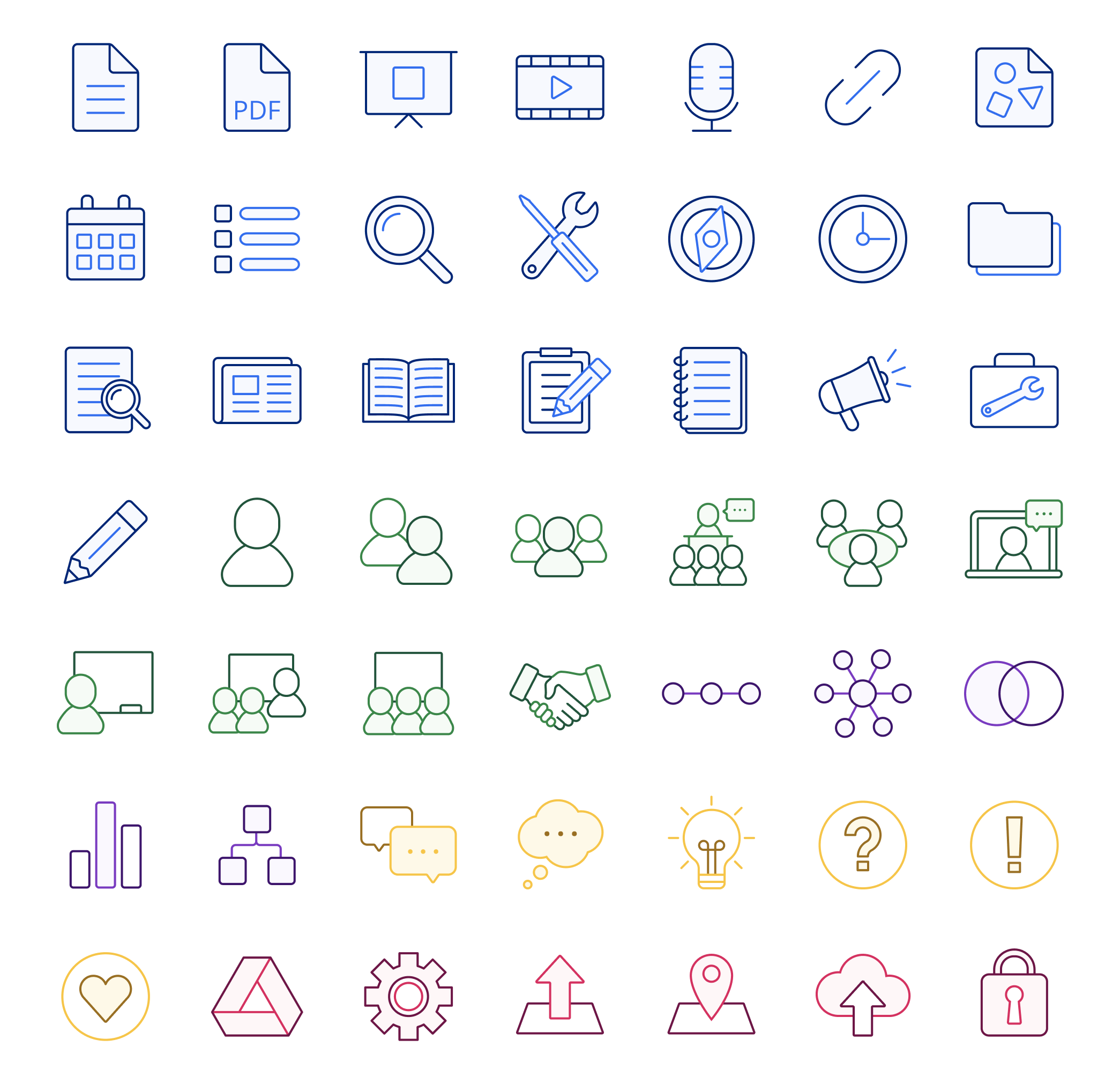
I also designed the pop-up menu and user flow for selecting icons, integrating it seamlessly into the content editor experience:
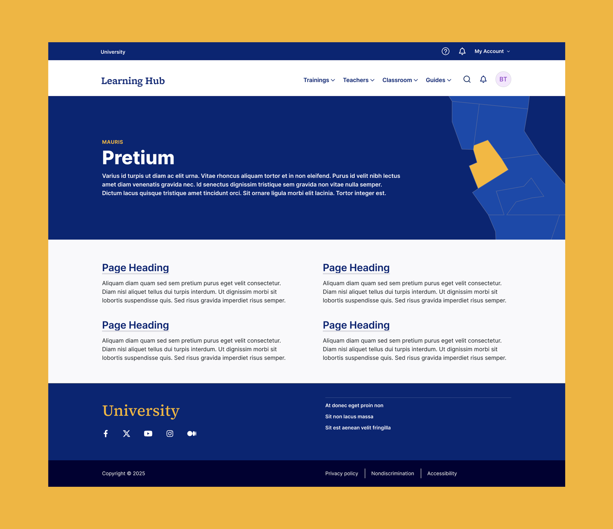
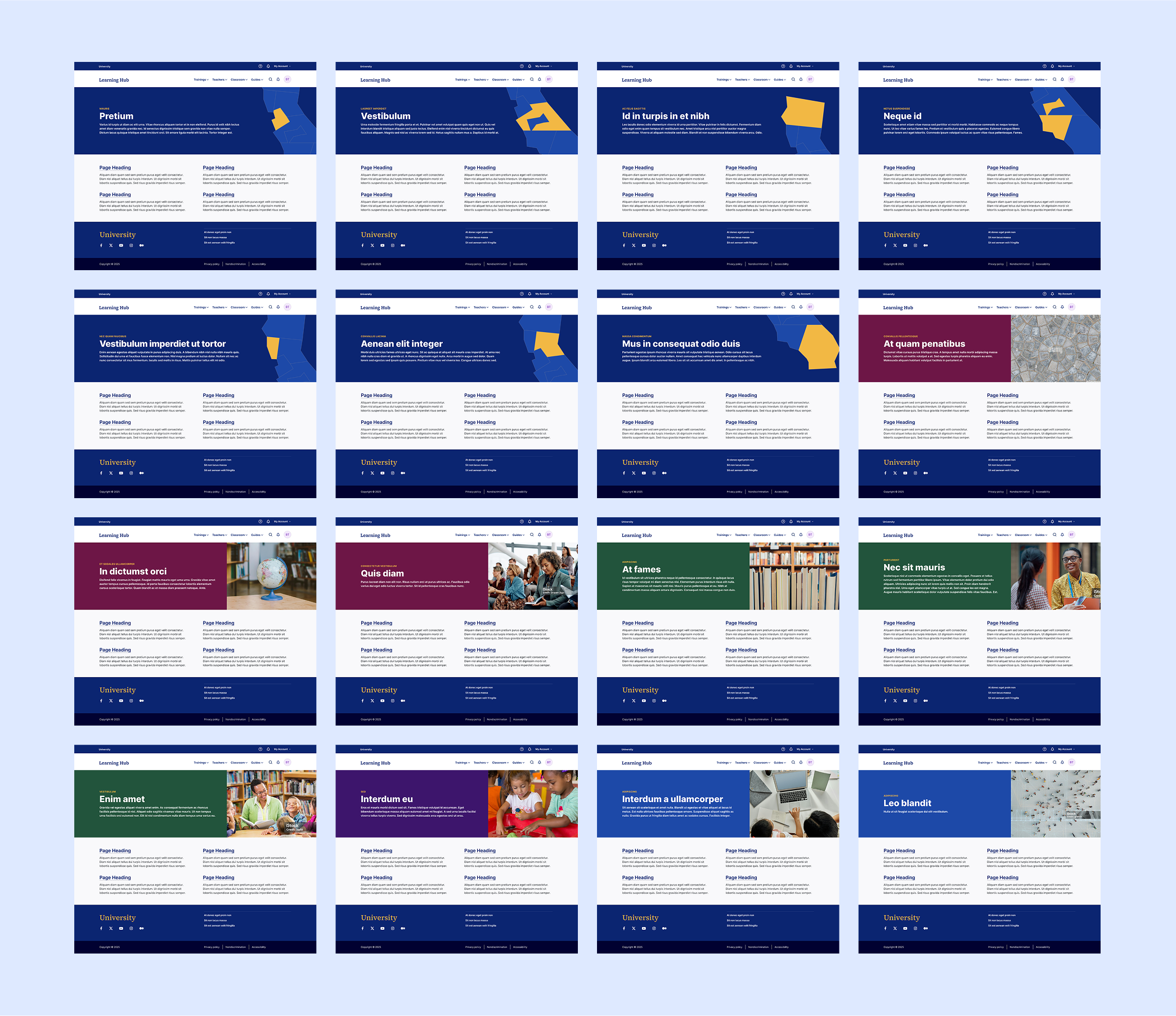
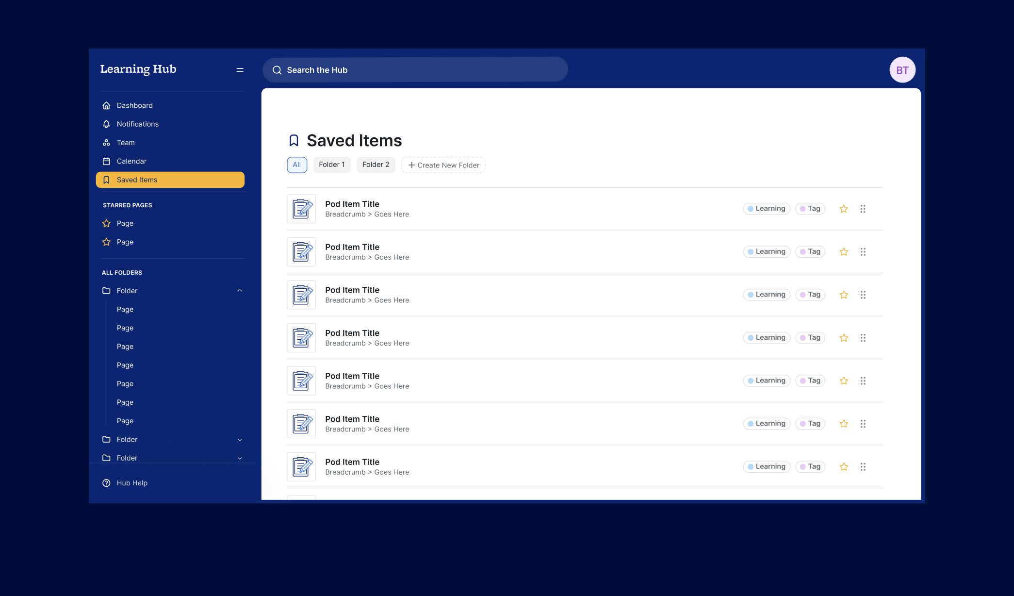
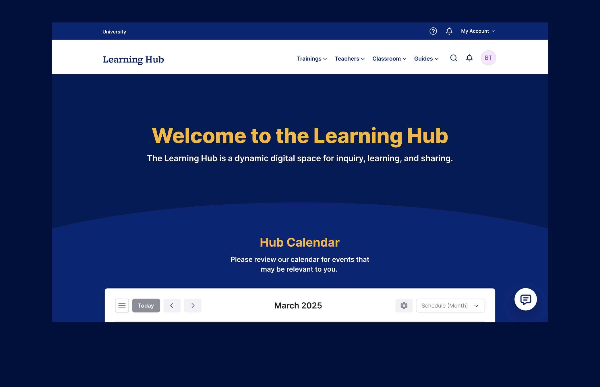
Modernizing Layouts and Aligning with University's Brand
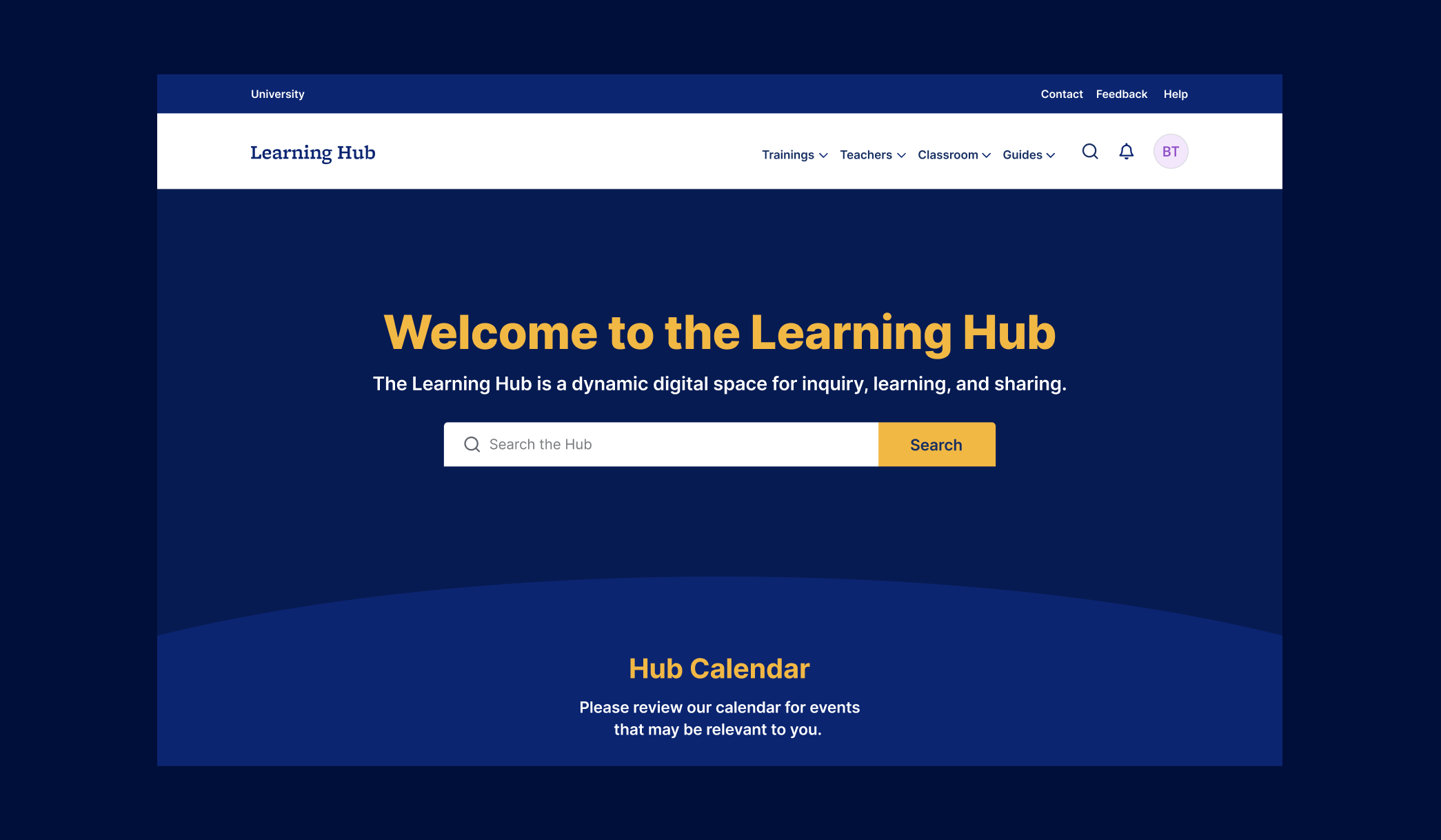
I introduced updated layout and imagery templates across key pages to bring greater consistency and visual clarity to the platform. These enhancements were developed in parallel with university's rebrand, ensuring full alignment with the latest branding guidelines.
I championed a bold use of the secondary color palette, implementing color-coding across platform sections to support clearer navigation and improve the overall user experience.

Starting with her first interview with us, Bonnie’s creativity, and calm and collaborative demeanor shone through. Bonnie is undoubtedly an incredibly talented designer and, also, just an absolute joy to work with. She took the time to really get to know our brand, the preferences of our stakeholders and demonstrated flexibility, patience, an orientation towards solutions, and immense creativity.
Looking Ahead: Dashboards, Search, and Messaging
As a side exploration, I began imagining how the platform could evolve into a dashboard-style application. This layout would better support task-based workflows and modular features.
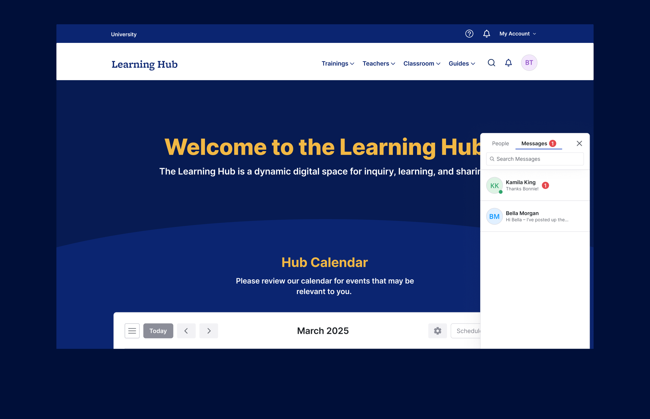
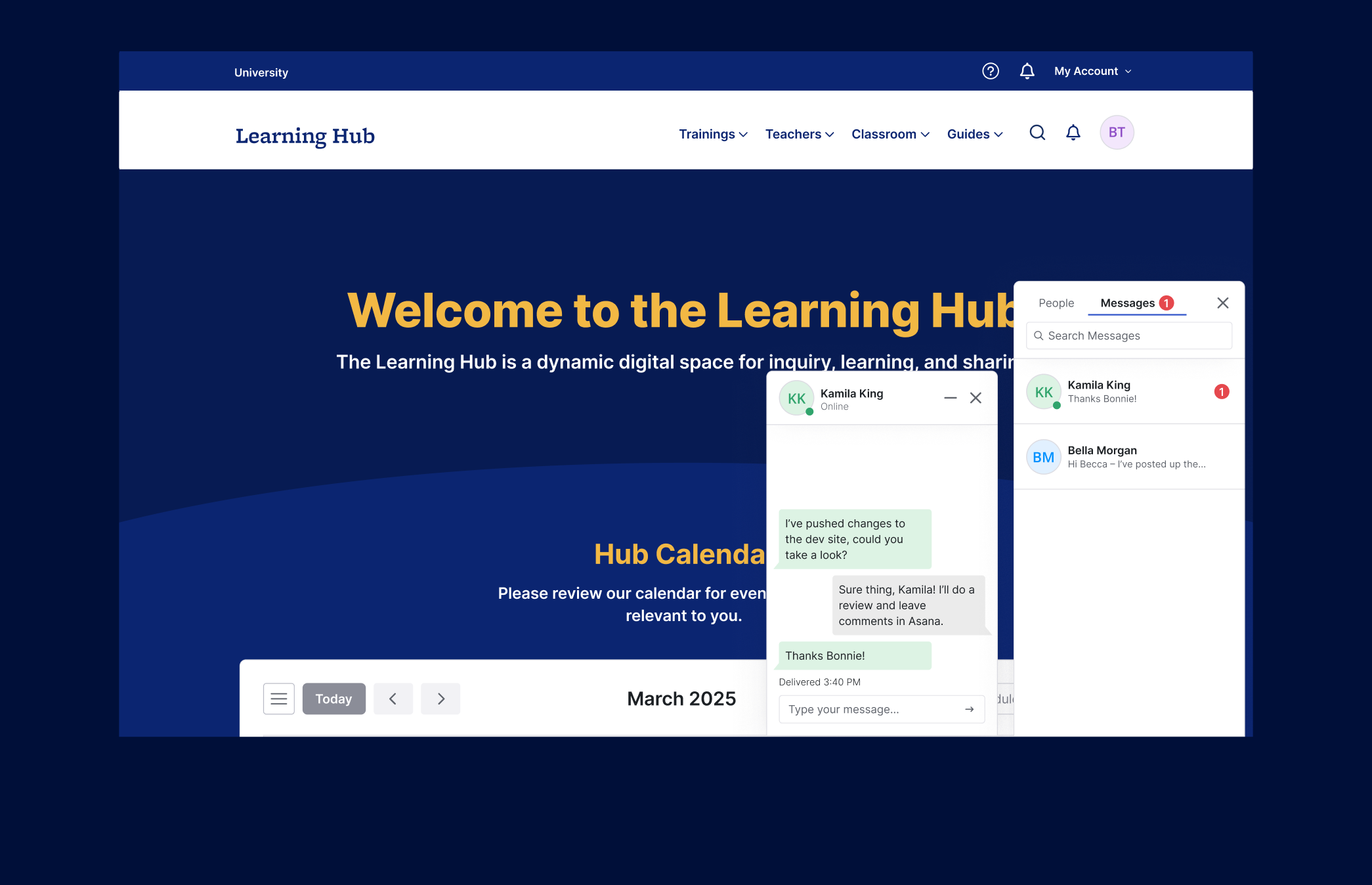
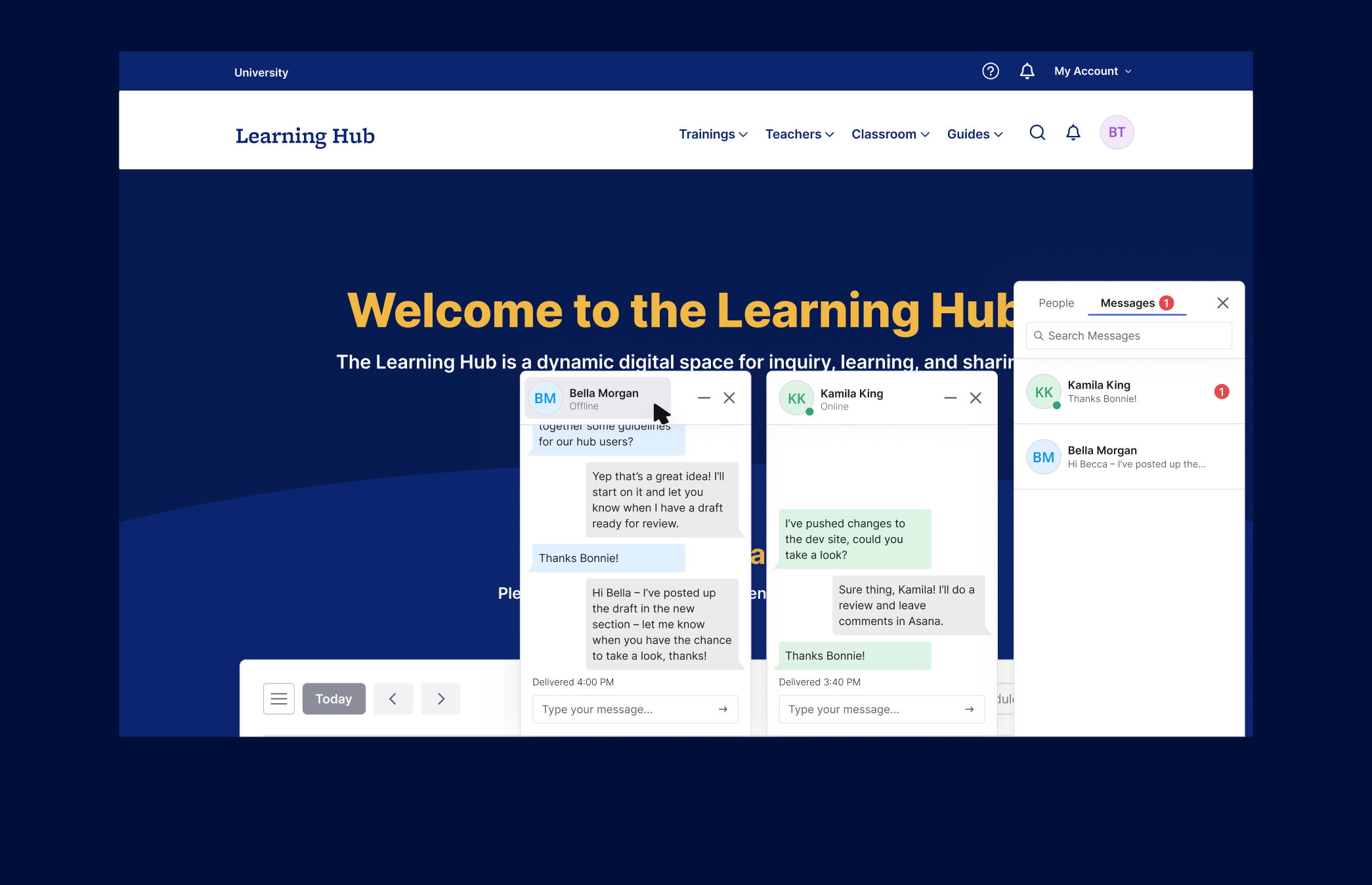
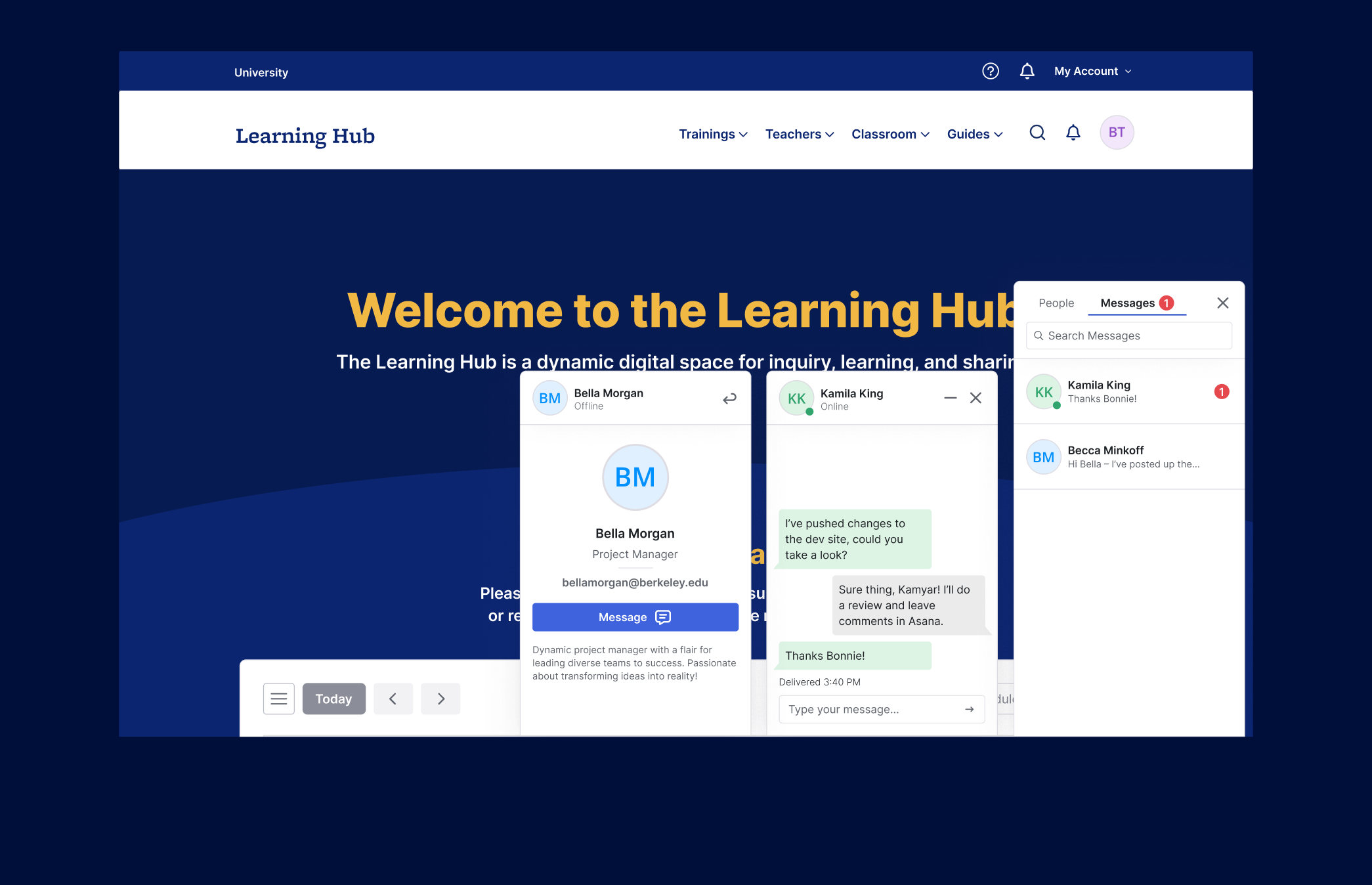
I explored initial concepts for messaging functionality, which could allow users to communicate directly within the platform—reducing the need for external email threads and increasing engagement.

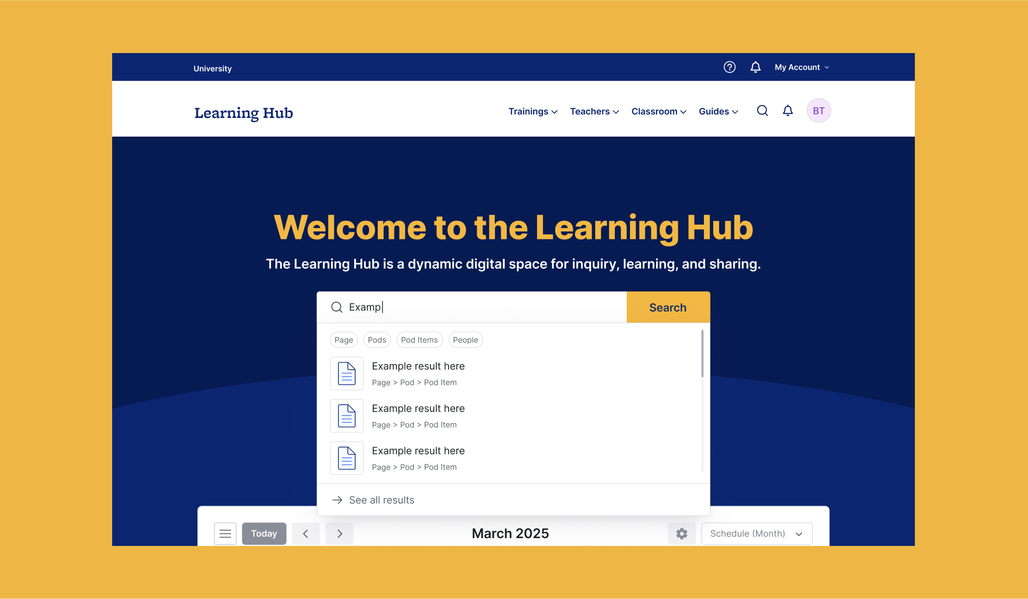
I also explored initial concepts for a unified search experience that allows users to explore content across the platform.
As our design lead, she skillfully translated complex requirements into elegant and responsive user interfaces that met or exceeded our expectations. Her expertise in color theory, accessibility, and spatial composition, combined with her mastery of Figma, made prototyping with her feel effortless. She was exceptionally organized, and consistently delivered with creativity, attention to detail, and a genuine enthusiasm that made collaborating with her both fun and effective.